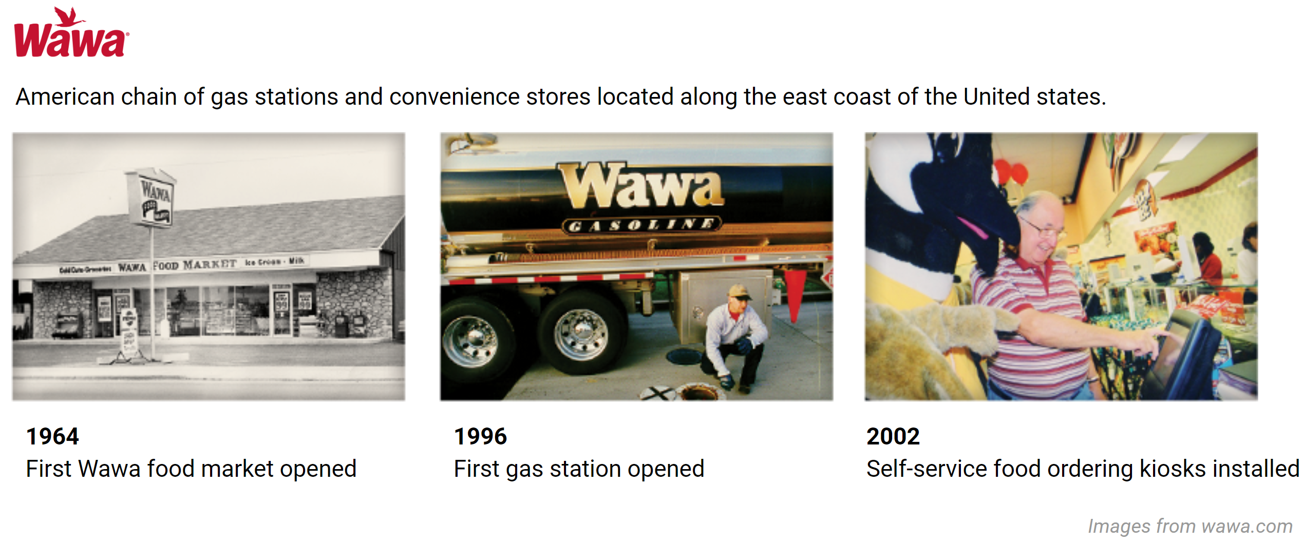
Hypothetical redesign project I did in the UX Design program at Maryland Institute College of Art. March, 2020
Practiced roles
- Product design
- Interaction design
- Visual design
- UX research
Intended audience
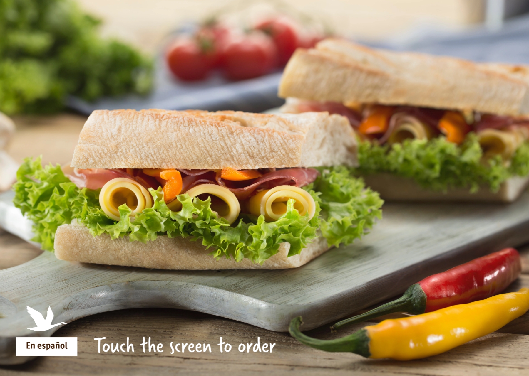
People who order food from the physical kiosk inside Wawa
Background & Process
Process
Discovery
- Secondary research
- On-site visits
- Heuristic review
Design
- Concept prototype (low-fi) + usability testing
- Usability prototype (mid-fi) +usability testing
- Stakeholder prototype (hi-fi)
Empathize & Define
Secondary research findings
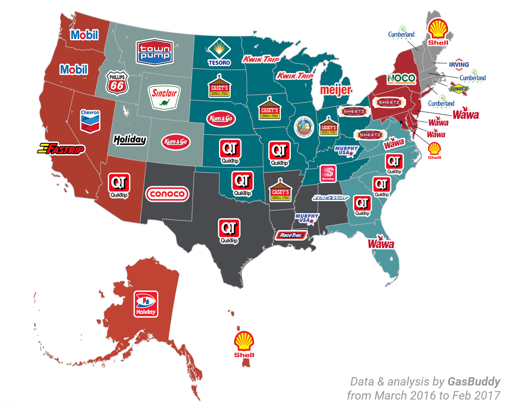
Top Rated Gas Station Convenience Store Brands in Each State
”"During 2019, more than half of visits (55%) at gas stations and convenience stores lasted longer than five minutes—far more than the average two-to-three minutes it takes to refuel a vehicle. This reflects a continued trend of convenience stores transforming into foodservice destinations for time-starved, on-the-go Americans."
—2019 GasBuddy report
Identified pain points
- Sandwich customization process is unintuitive & error-prone
Cannot build a sandwich from scratch
Opportunity Statement
We want to keep improving the experience of the self-serviced food ordering kiosks to increase customer satisfaction, build loyalty, and assist the overall growth of the brand in the rapidly evolving and competitive market.


Concept Prototype
(Low-fi)
Question: What are the pros and cons of linear process vs. modular process?
- I created two versions of the flow, Linear and Modular.
- I invited 4 people to do the in person usability testing. Each of them were shown both options in a random order.
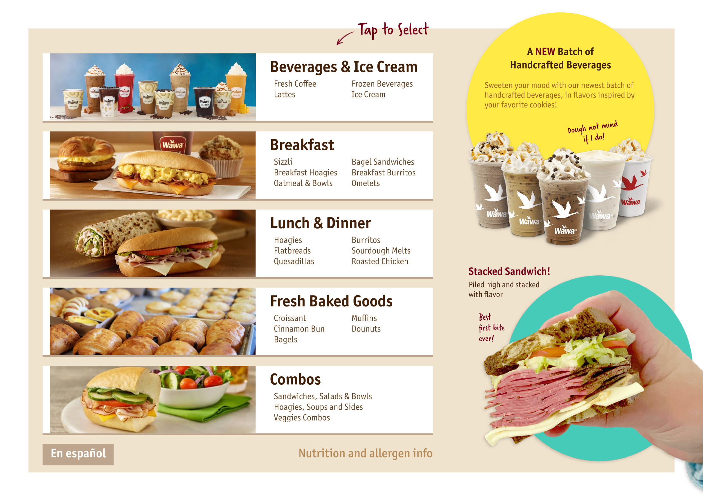
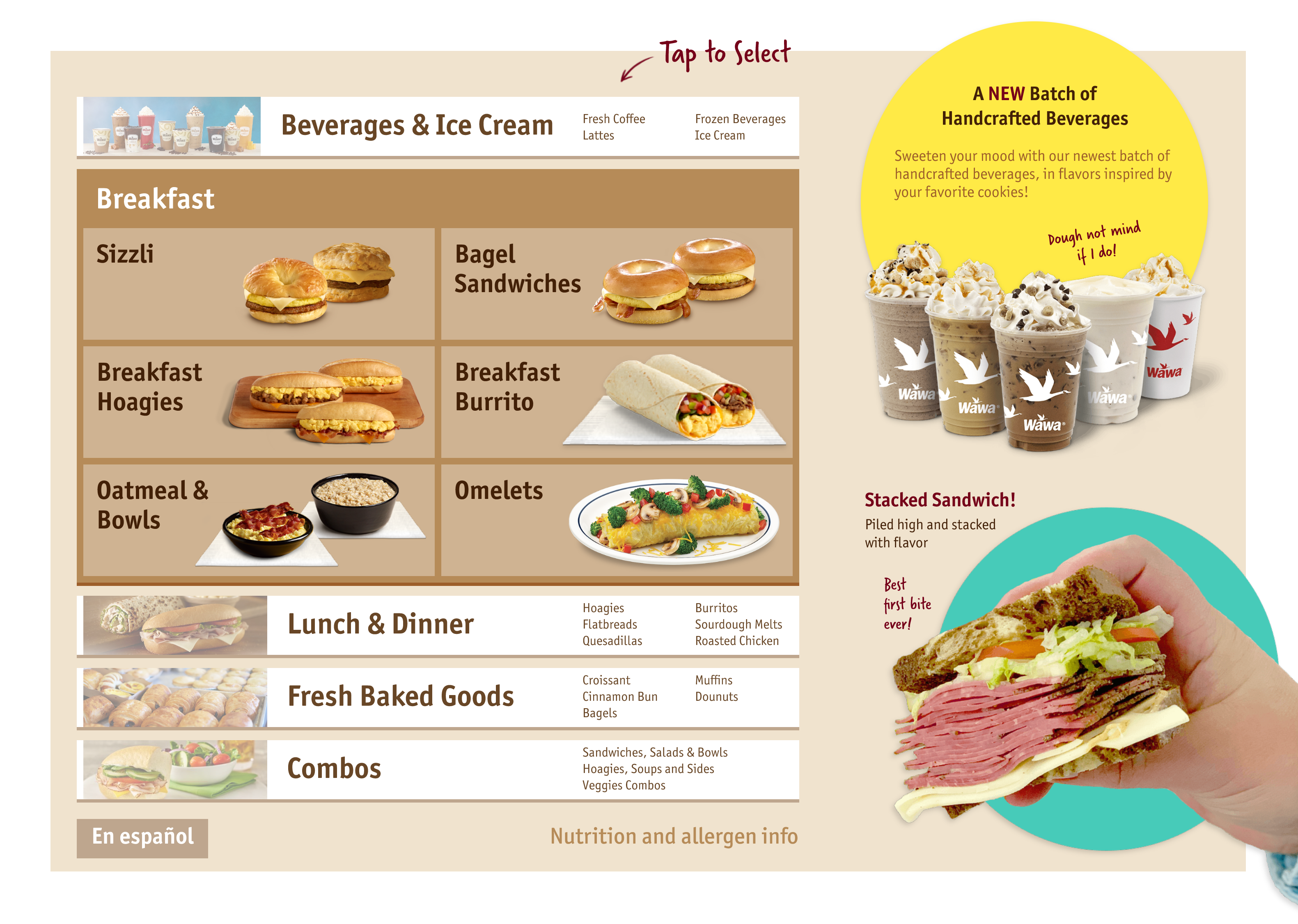
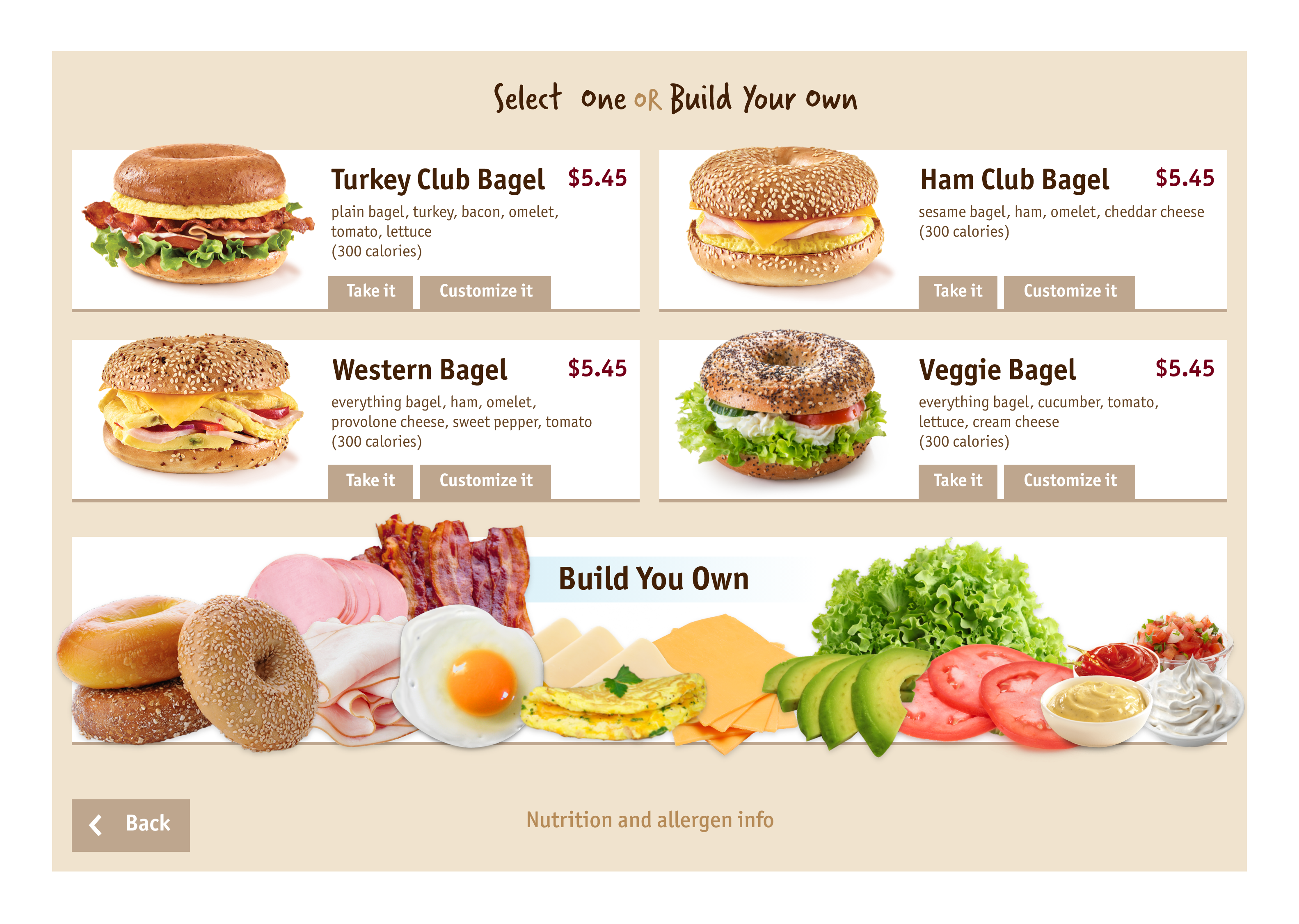
Sample screens (Linear)


Sample screens (Modular)


Usability testing findings
Issue: The arrows were perceived as scrolling through options only, not going to the next step.
Issue: Some users did not register this as a button.
Issue: If the users can only make one choice on a page, the users expected it to auto-advance when the action is done.
Effective: The users were not confused about the tabs/modules and used them often.
Issue: Some avoided clicking this because they don’t know what to expect when clicked.
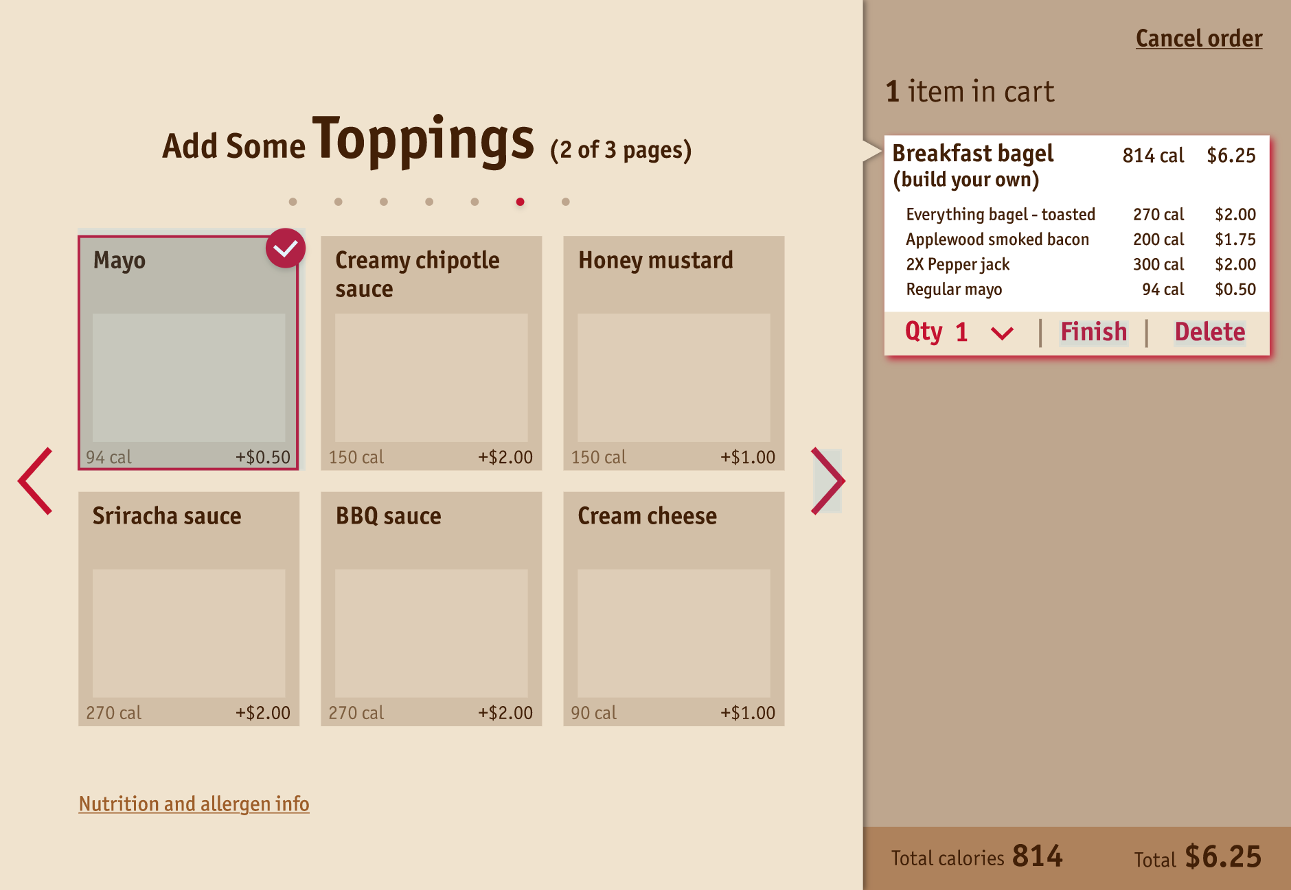
Usability Prototype
(Mid-fi)
Goal: Allow users to customize and edit the items with highly flexible UI/UX design.
- Due to the slight preference towards the Modular flow from the last round of testing, I continued with the Modular design.
- I thought that maybe we could give the users more flexibility and allow them to change things mid way quickly instead of having to go back step by step.
- I invited 3 people to do the in person usability testing.
Sample screens


Usability testing findings
Effective: The users were not confused about the tabs/modules and used them often.
Issue: Users’ mental model is that the right panel is the cart, which means that the ingredients shown there are already added and won’t be editable. Although I thought allowing them to quickly edit things in the cart may add convinience, it conflicts with their mind model.
Effective: The arrows and the buttons helped distinguish “scrolling for more” vs. “go to the next category”.
Issue: Repetitive buttons are confusing. They also make the users feel overwhelmed – too many choices to make.
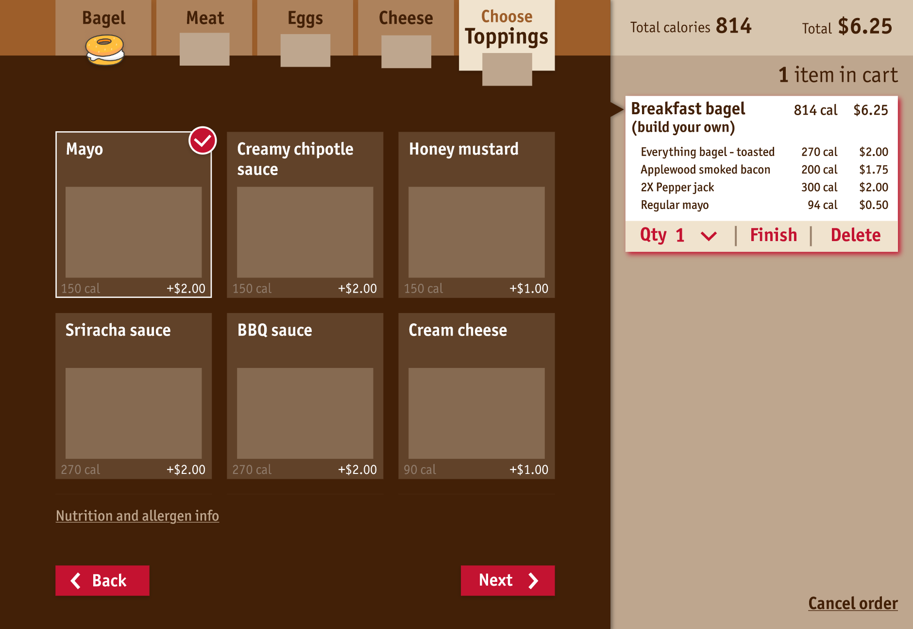
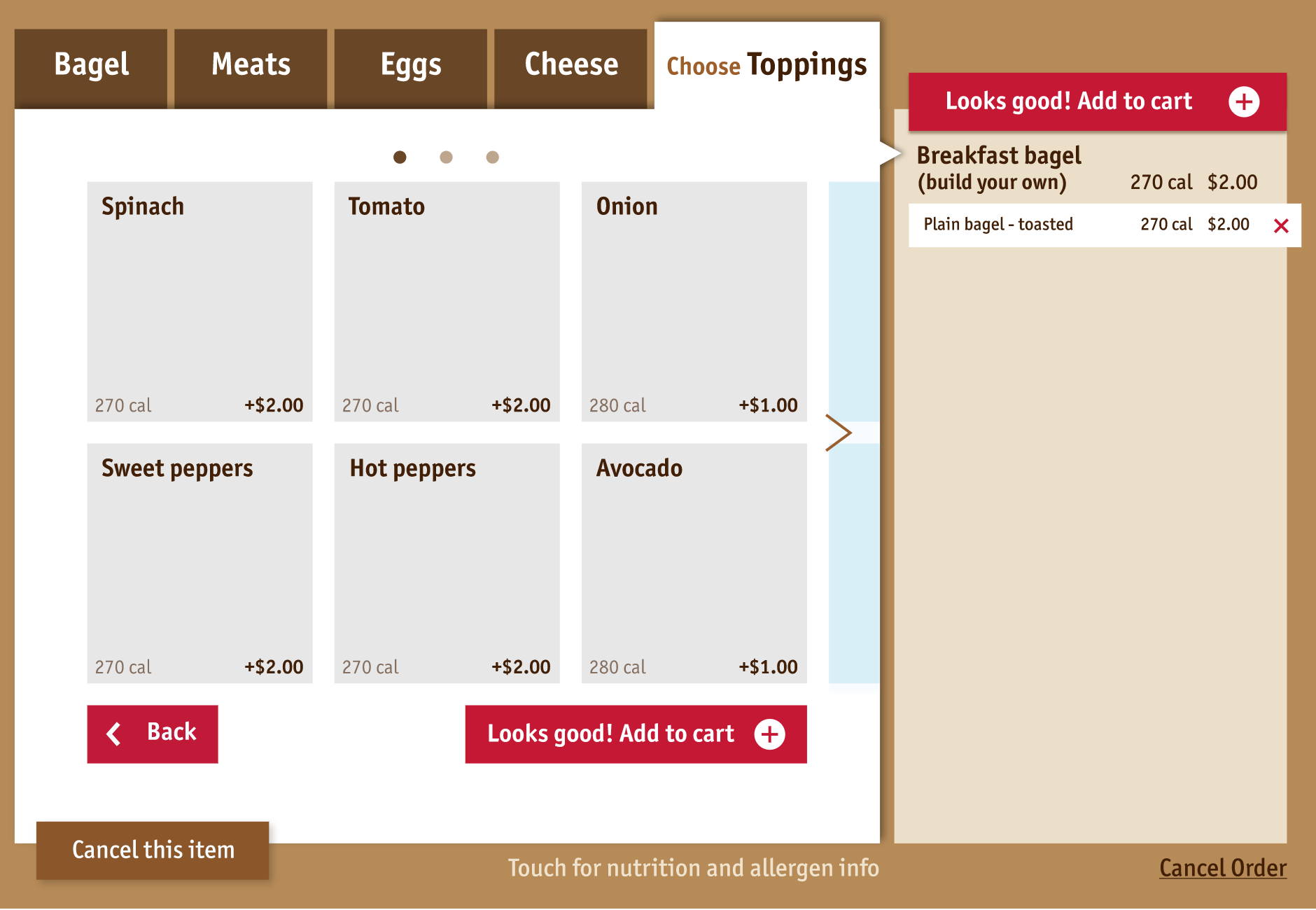
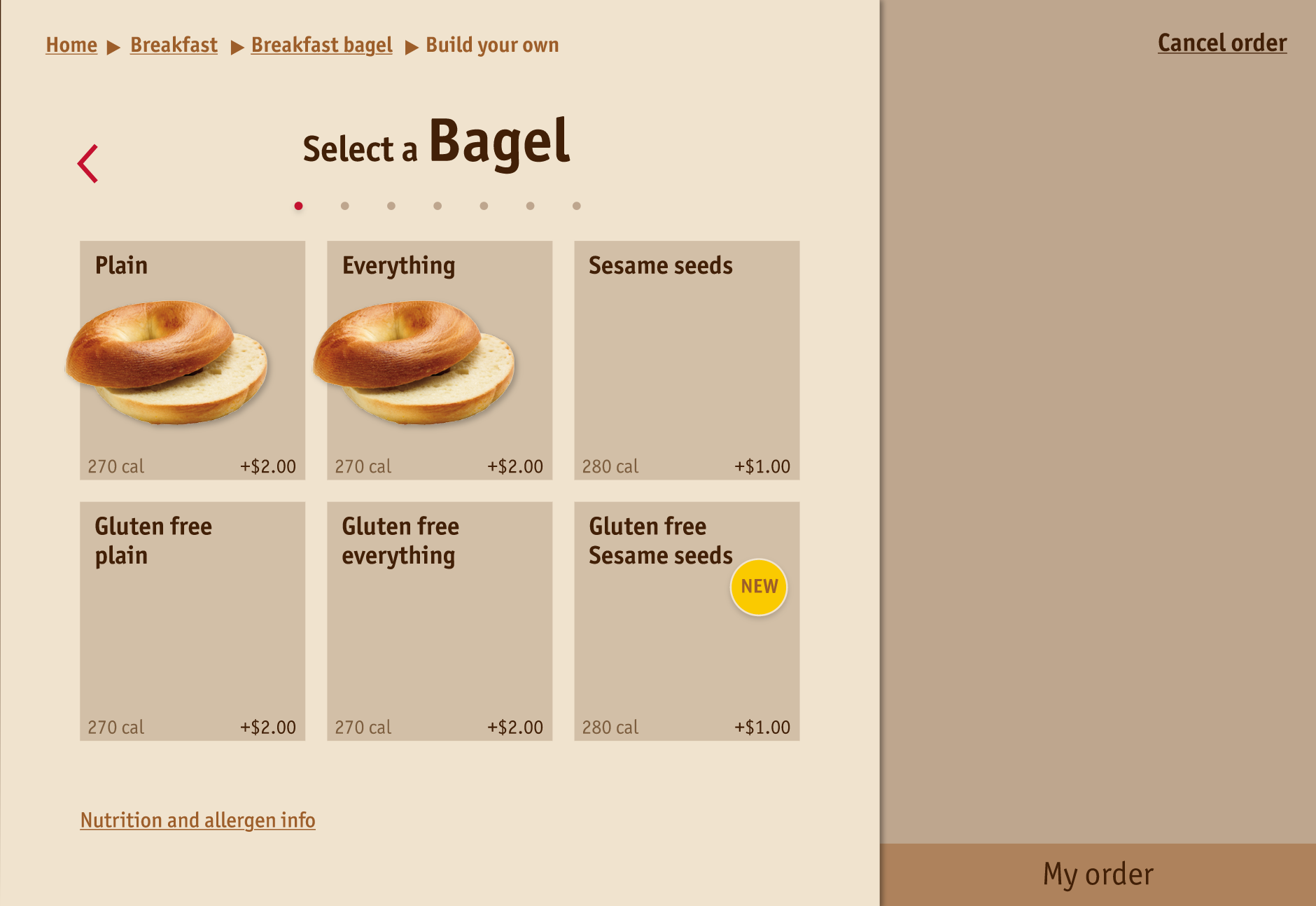
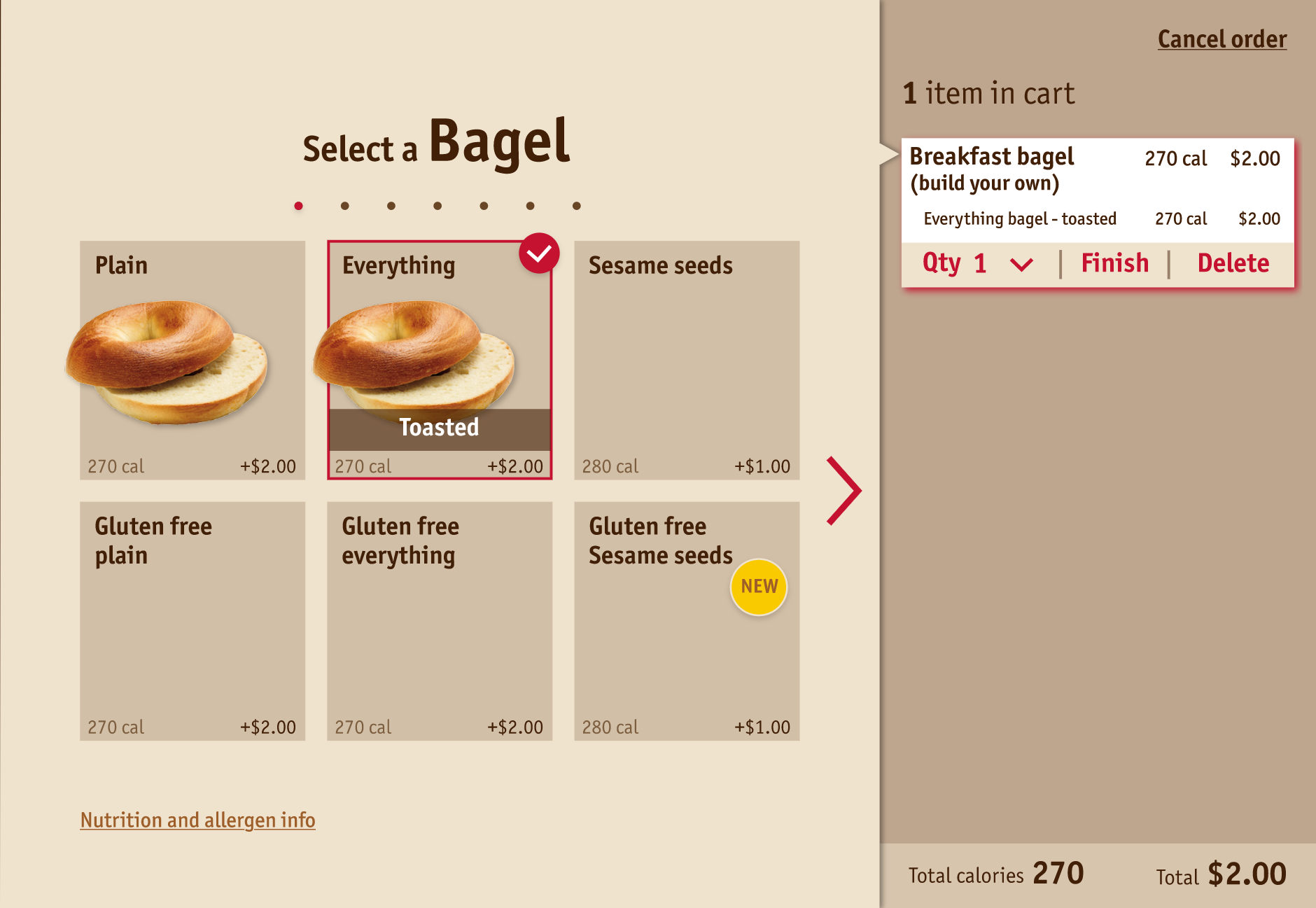
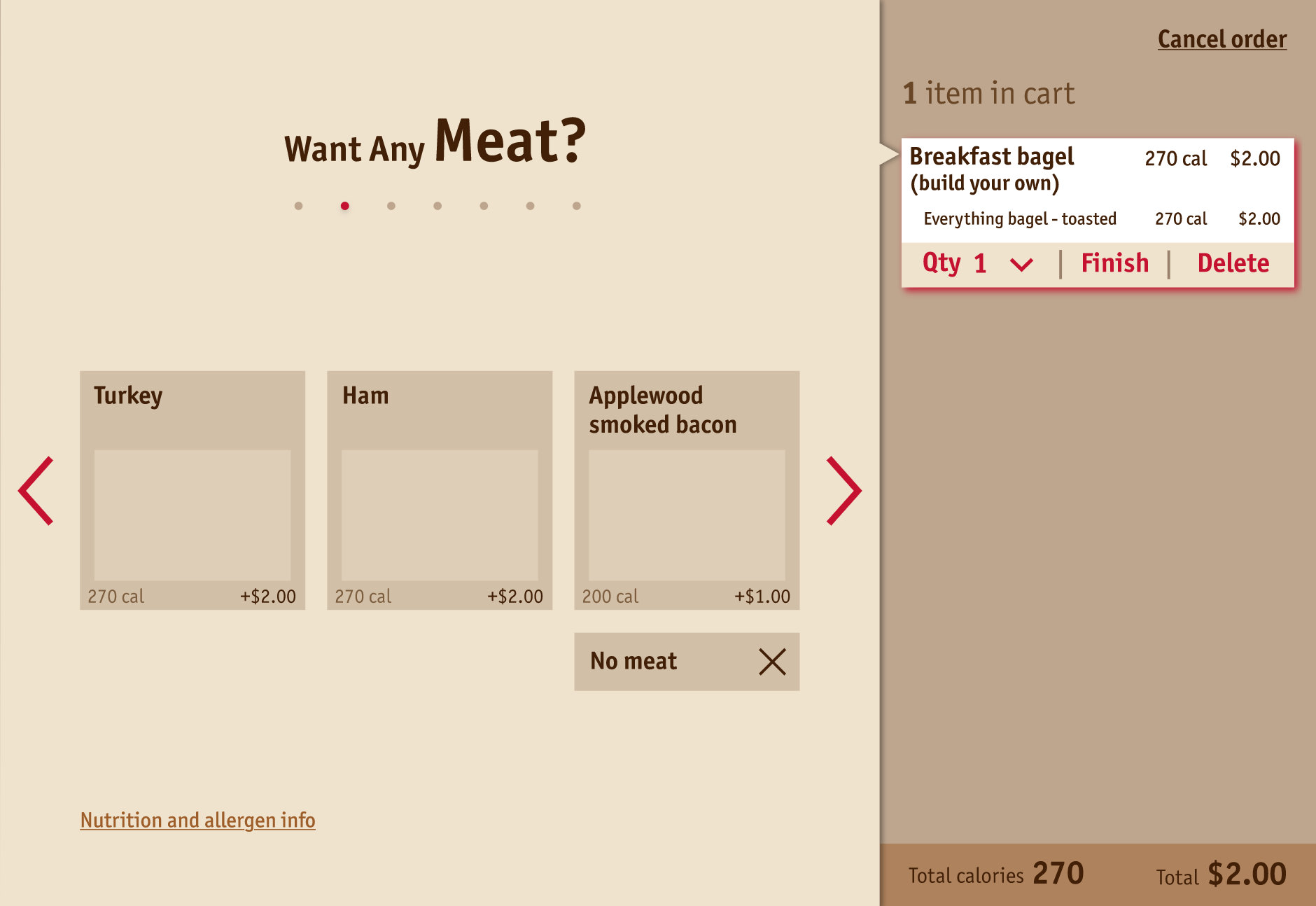
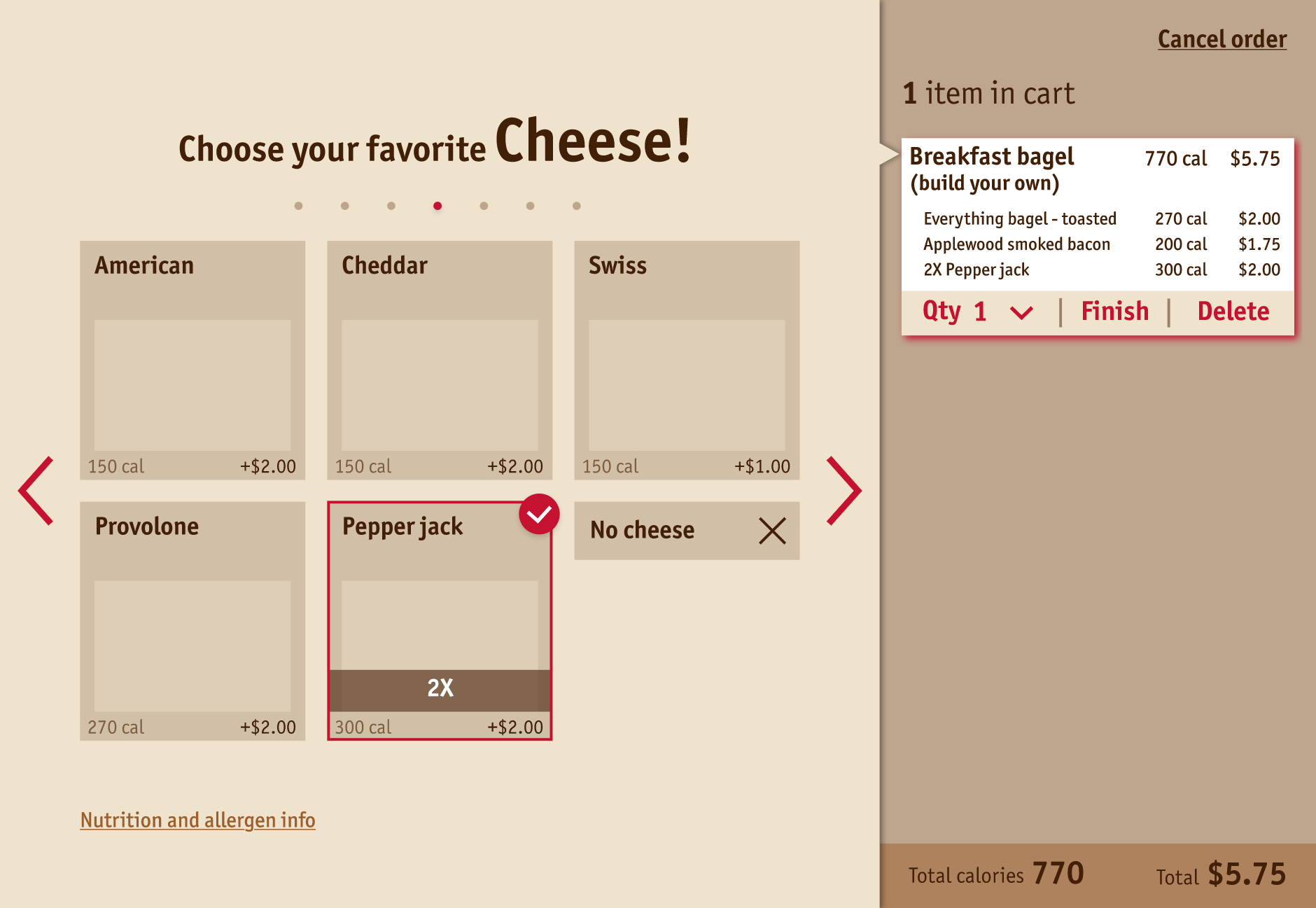
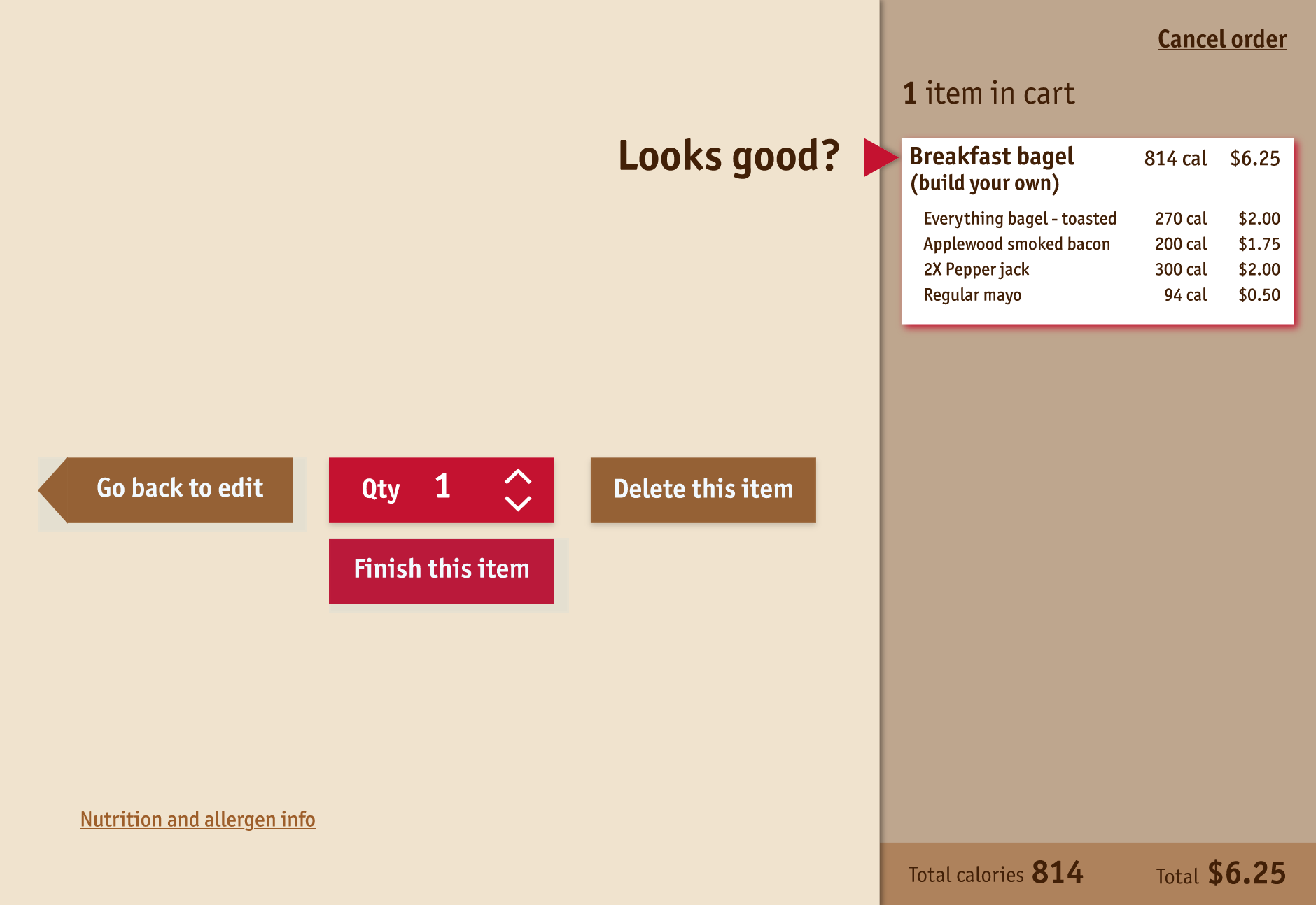
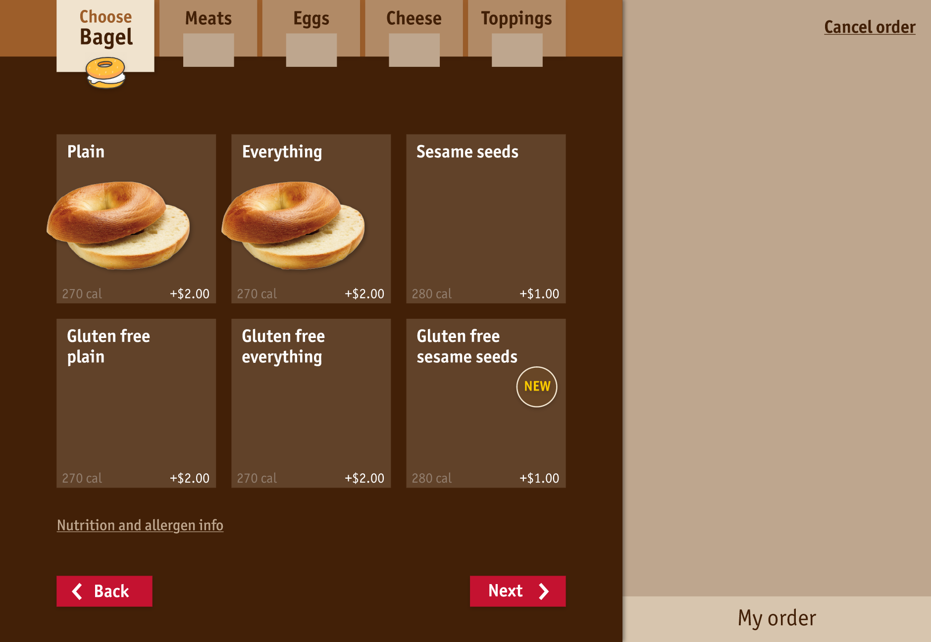
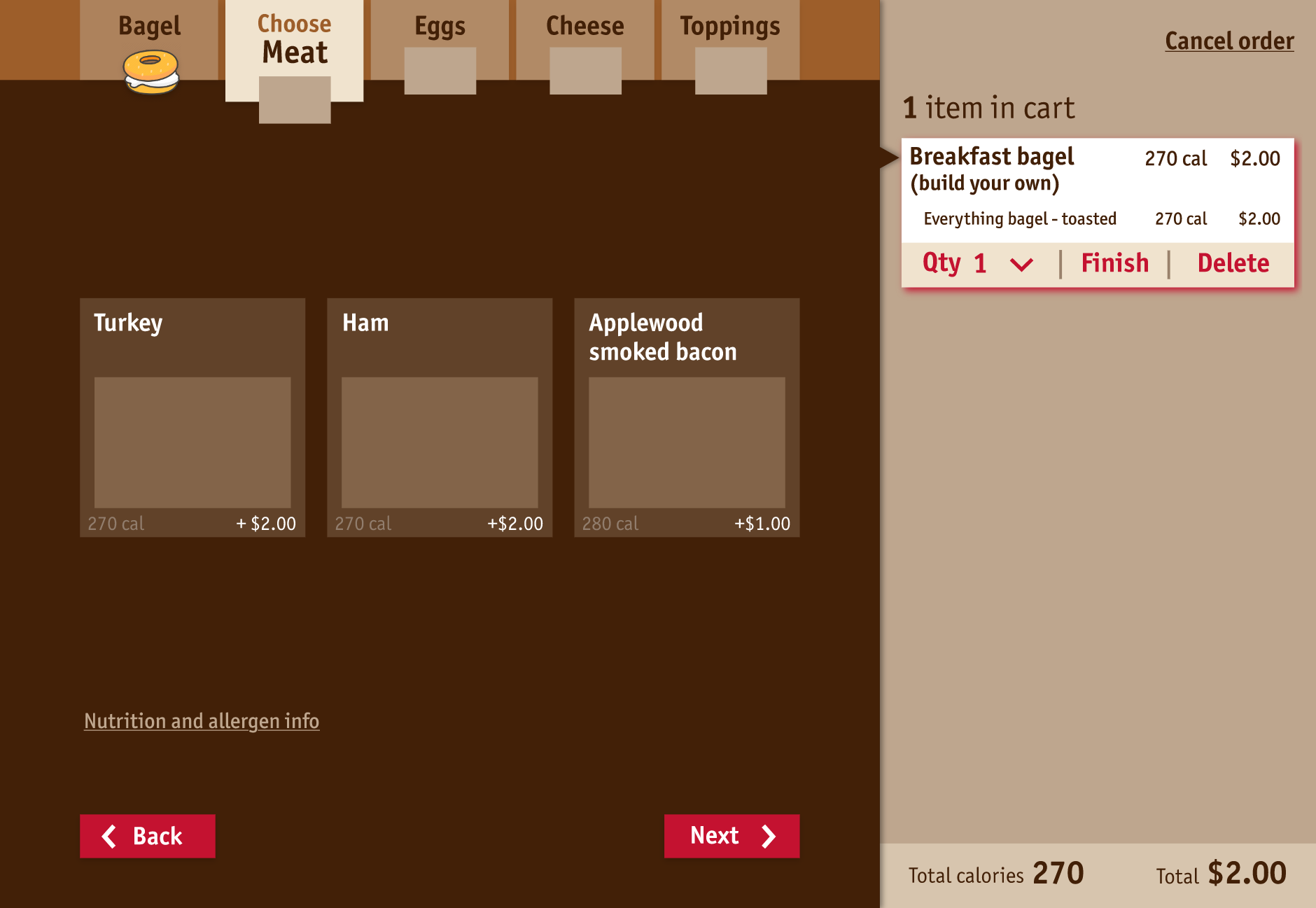
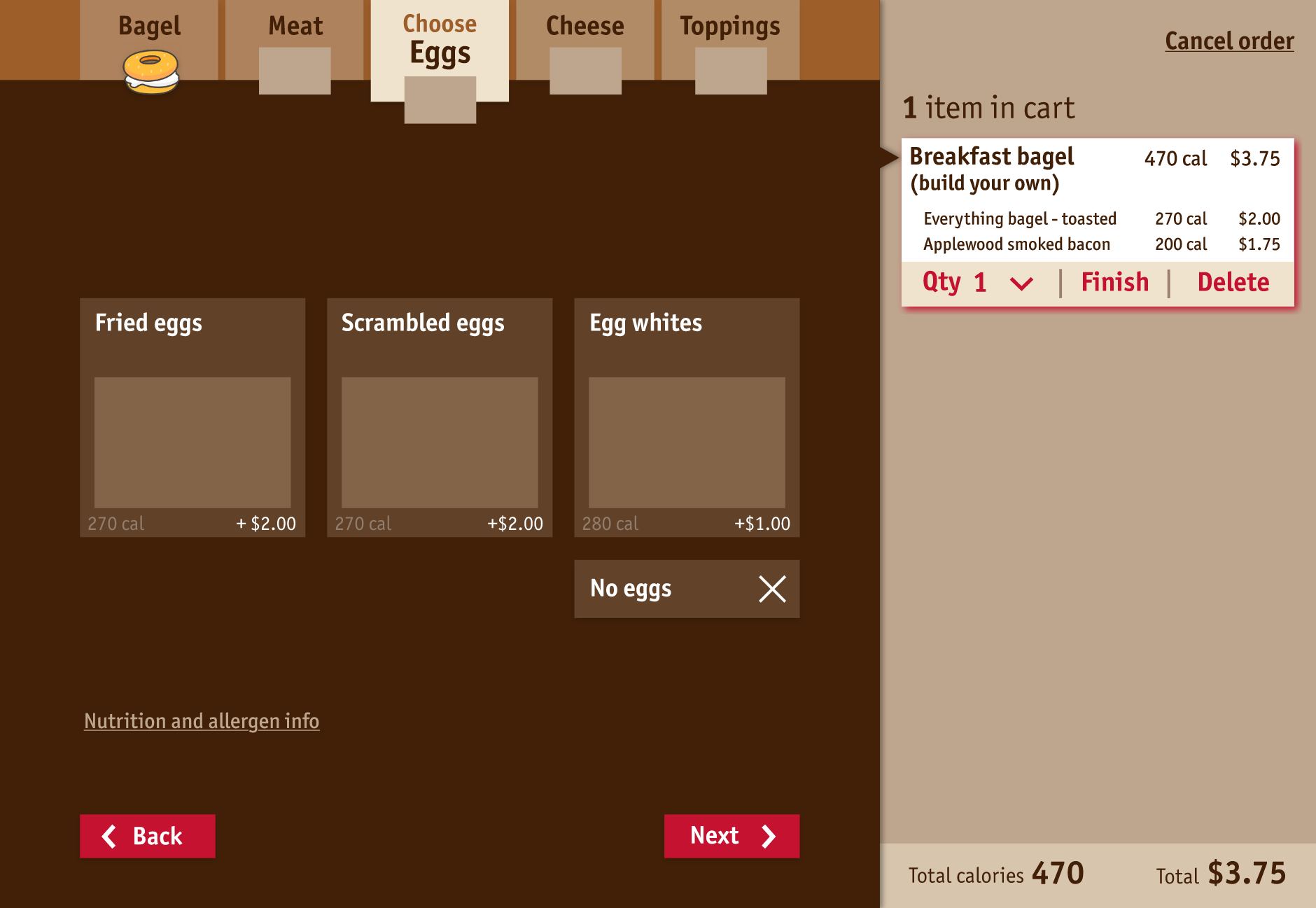
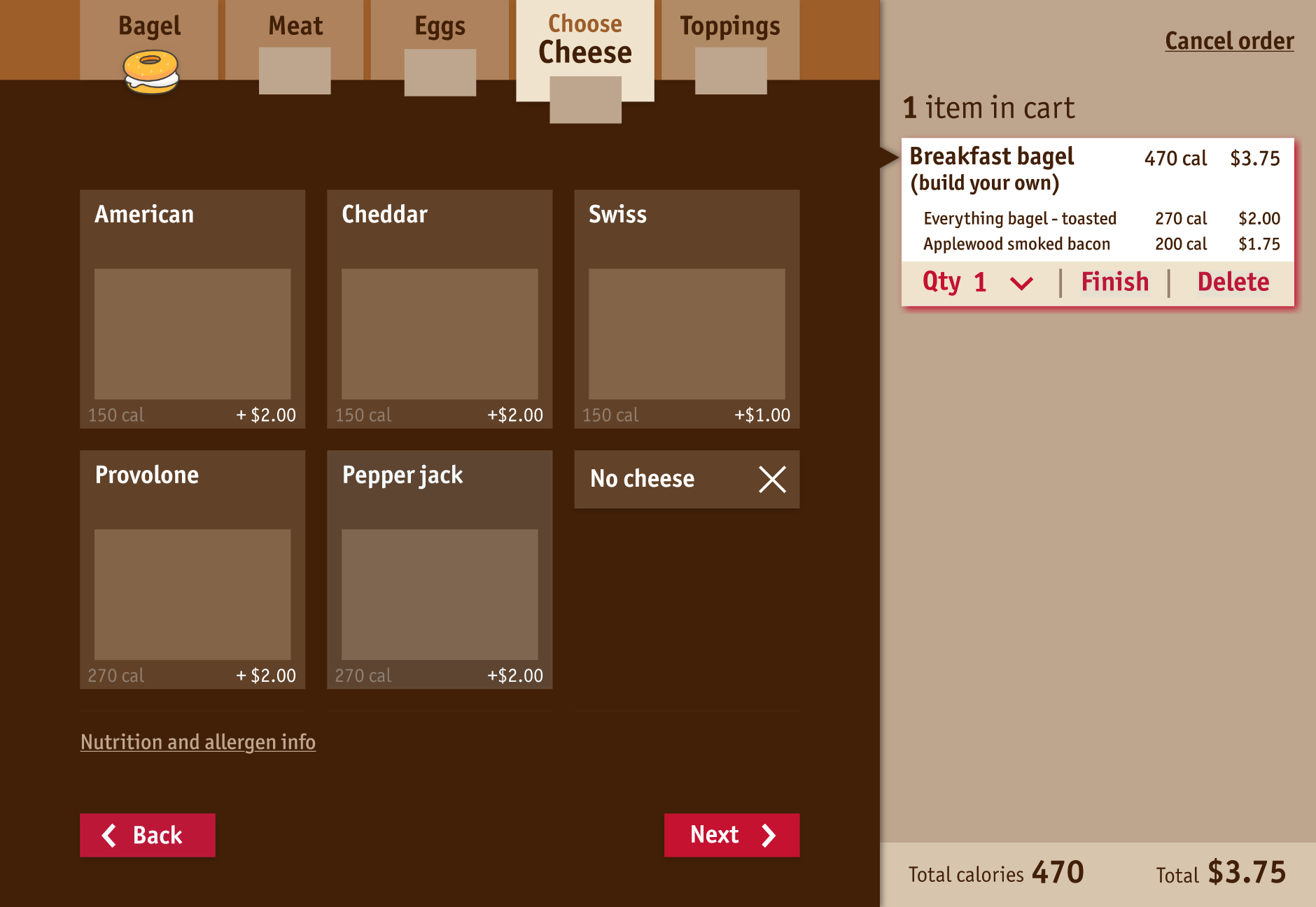
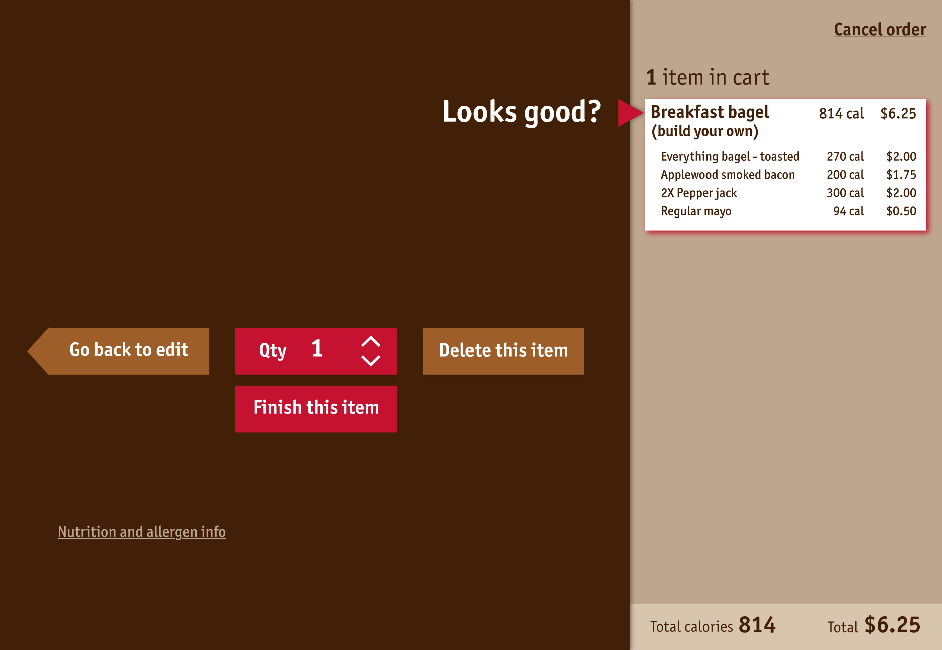
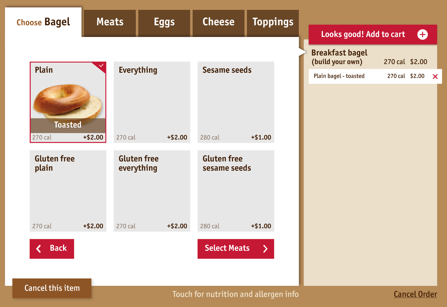
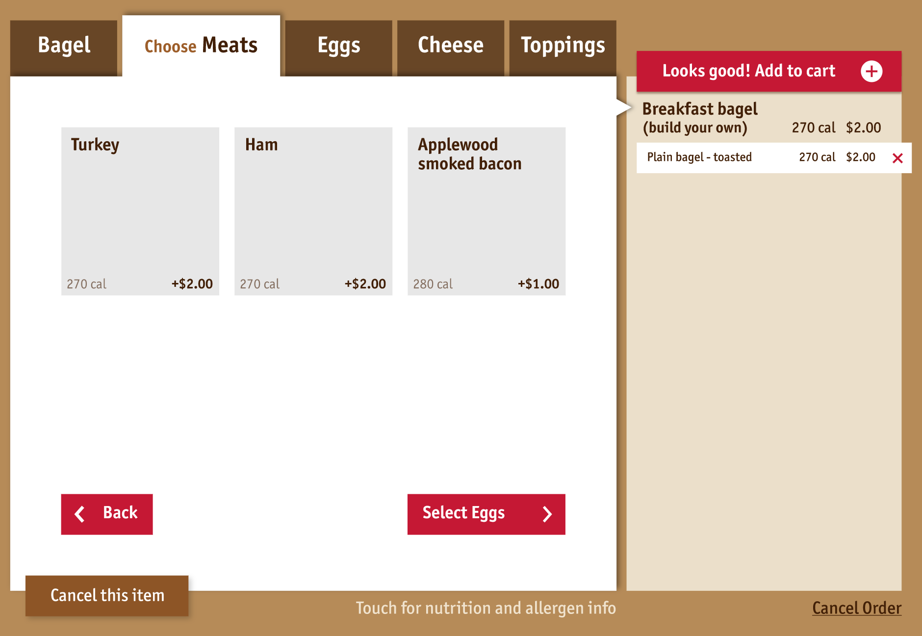
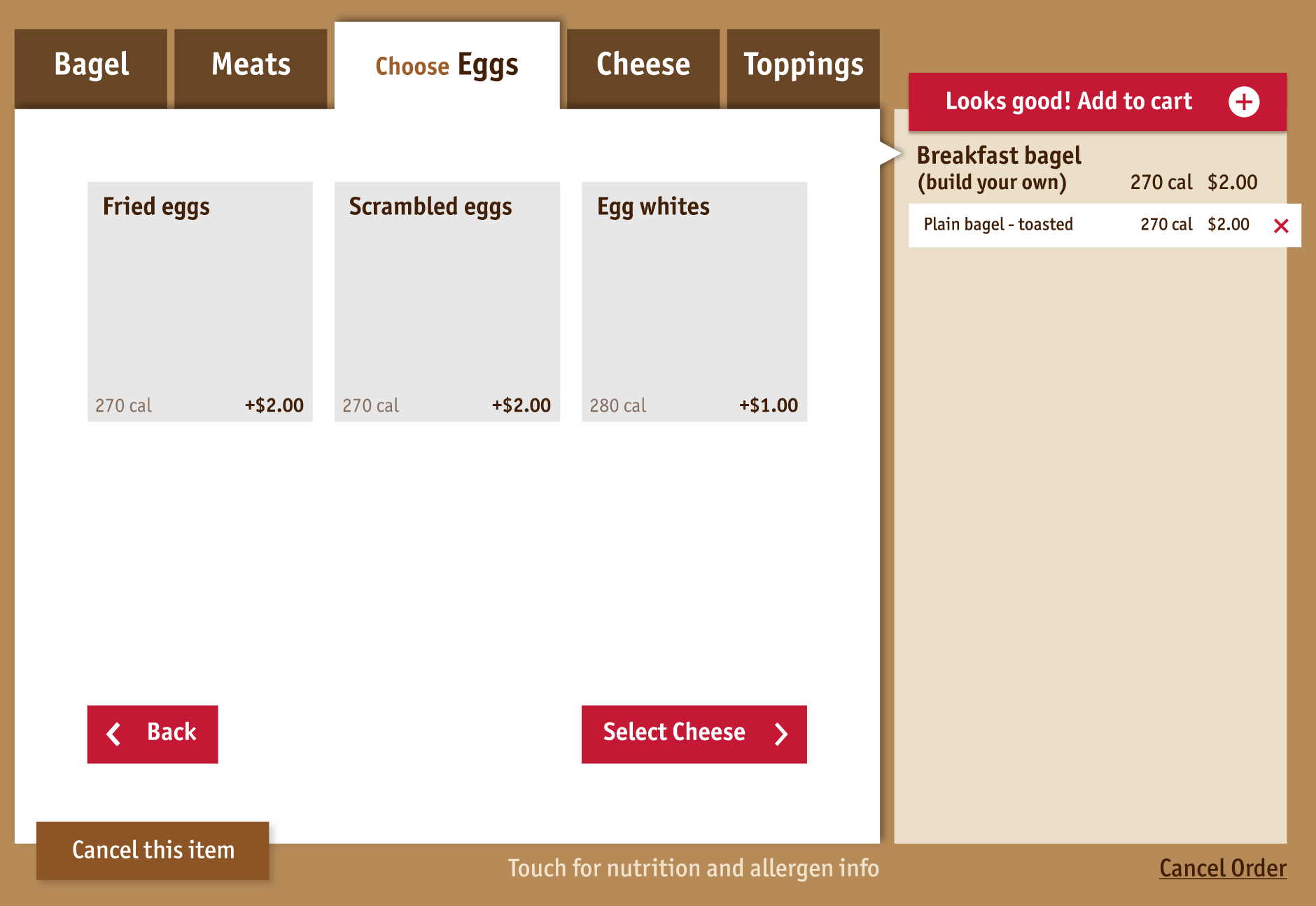
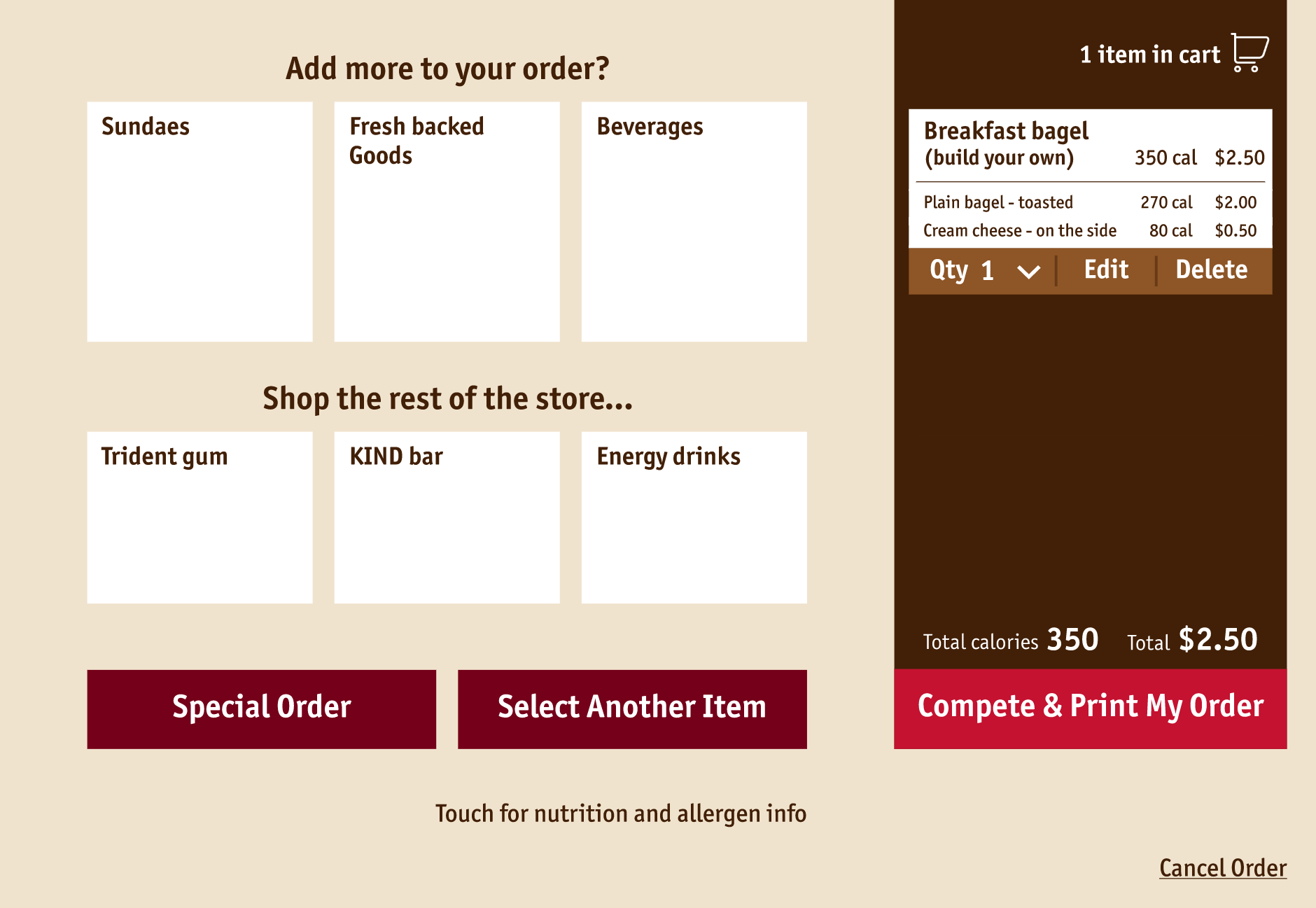
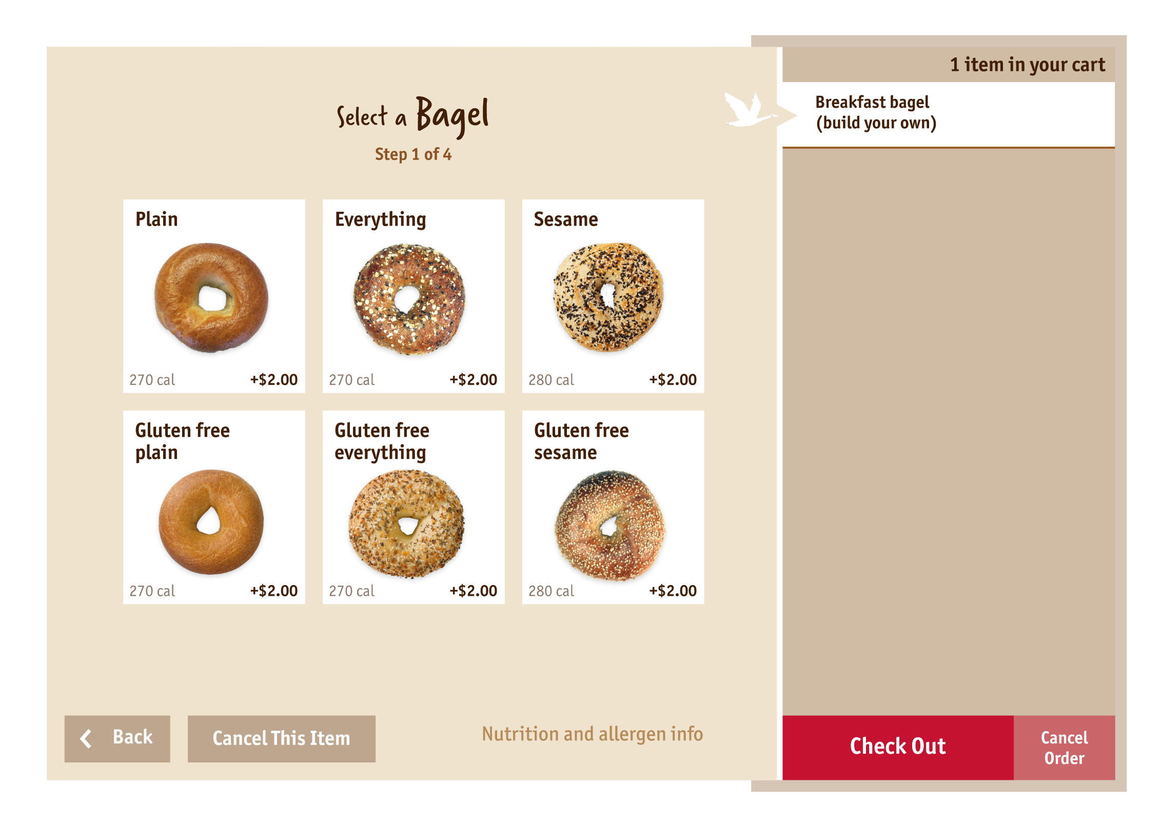
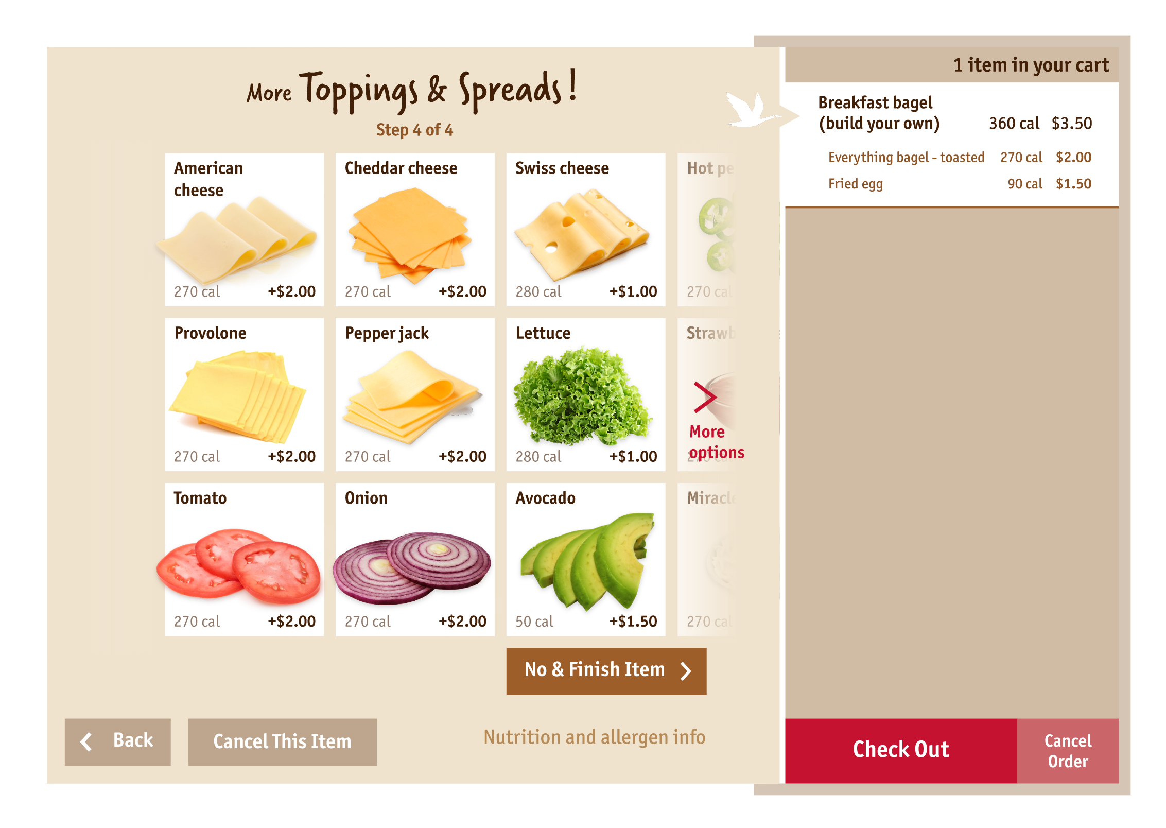
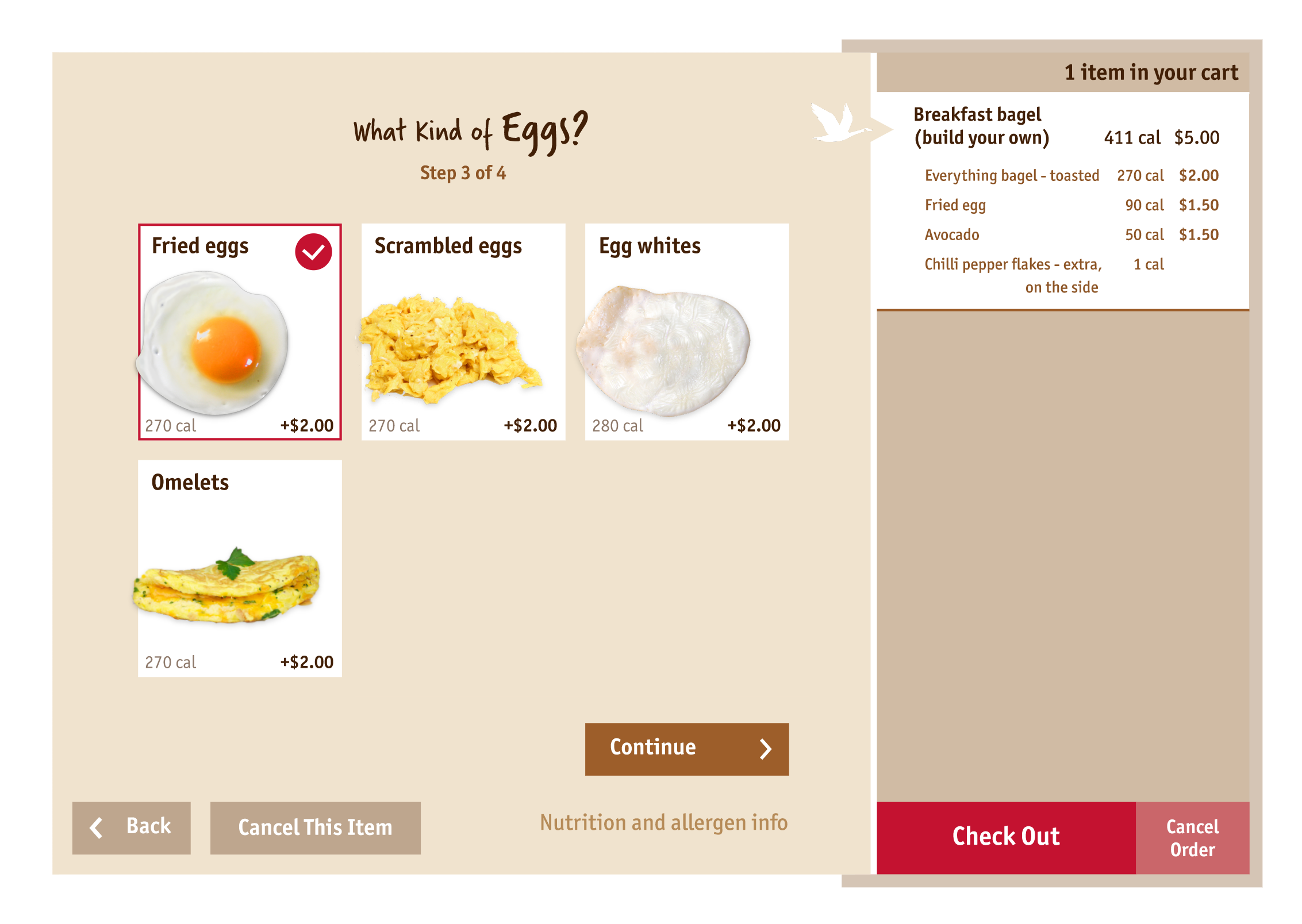
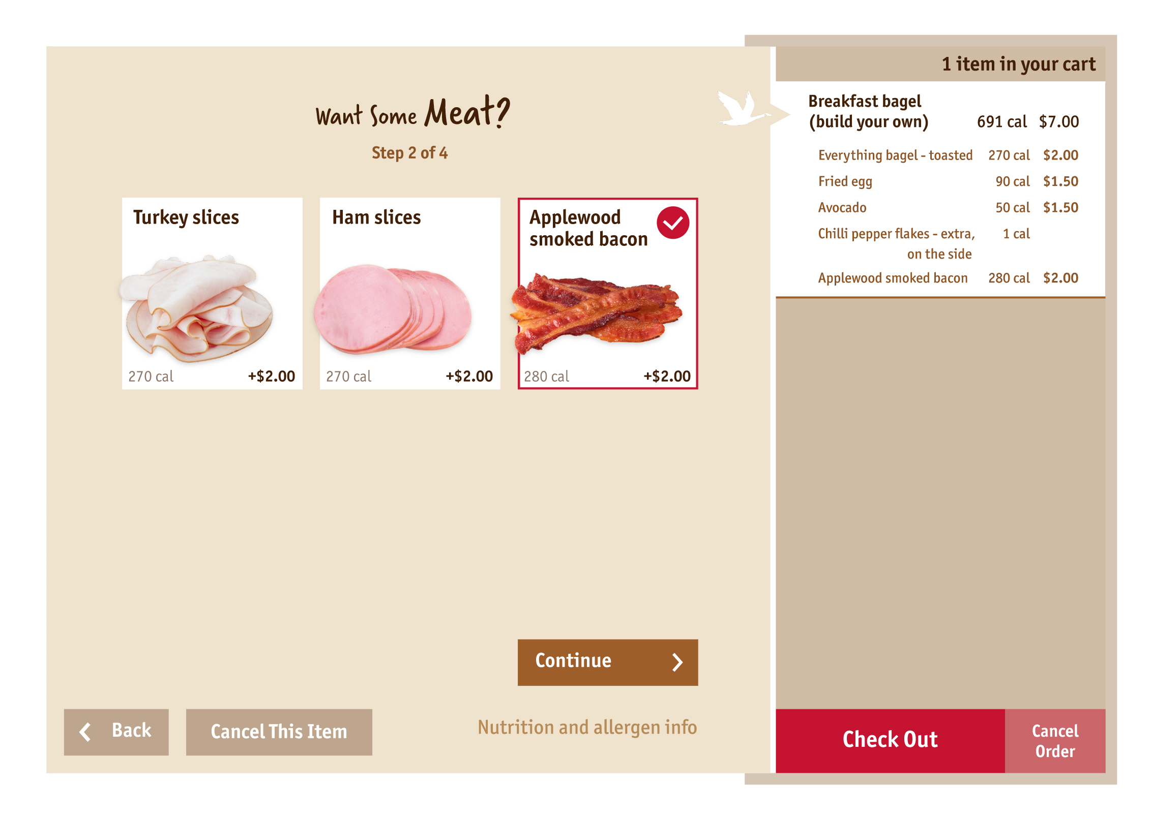
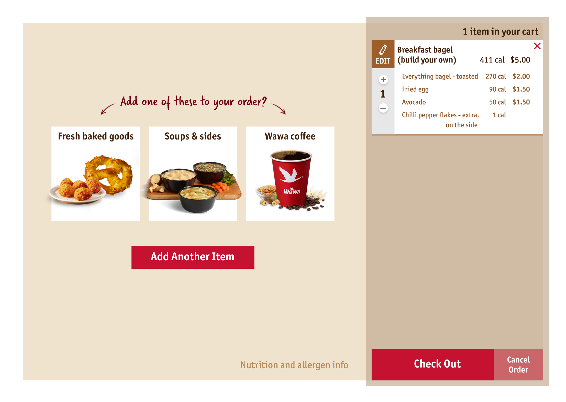
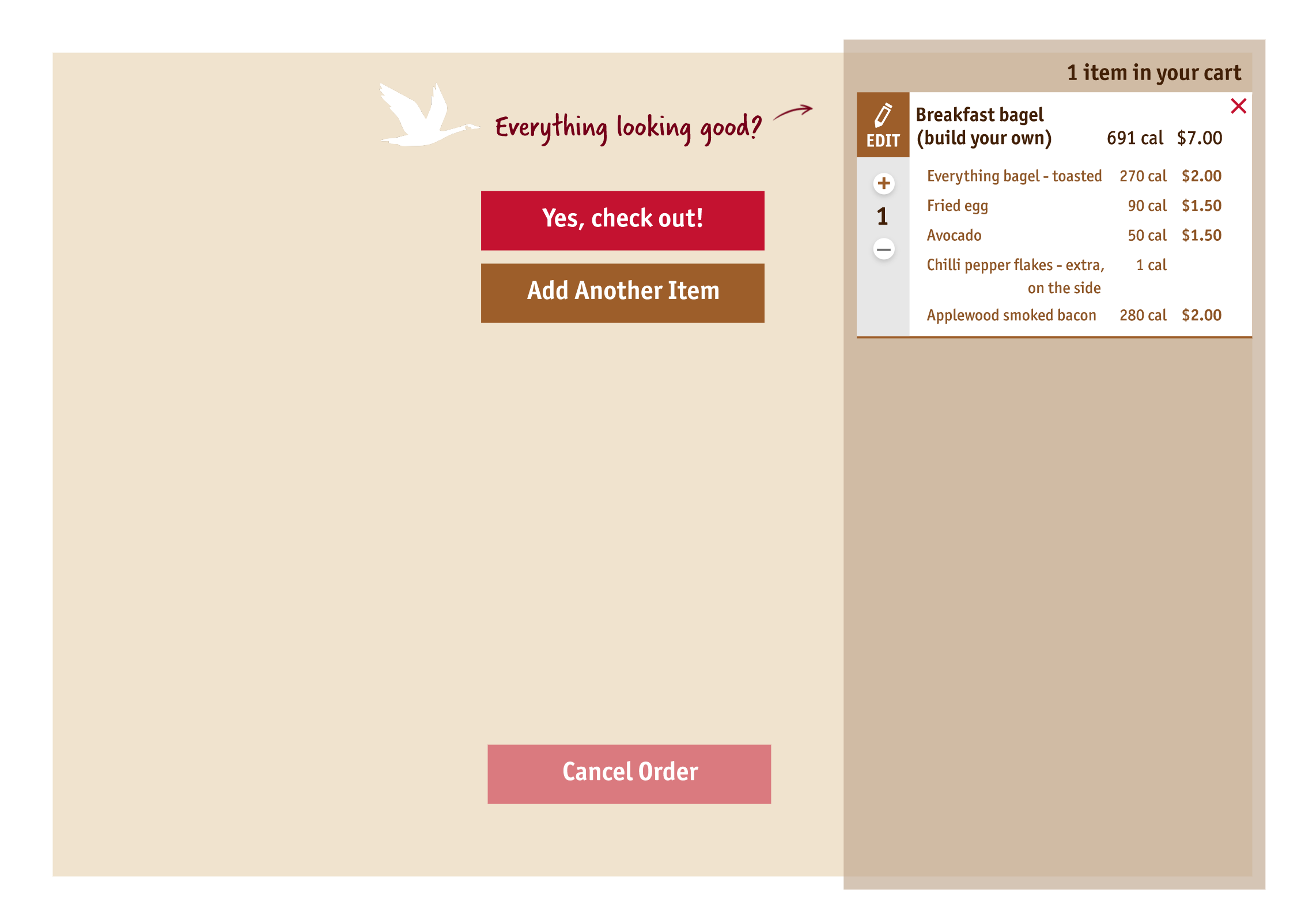
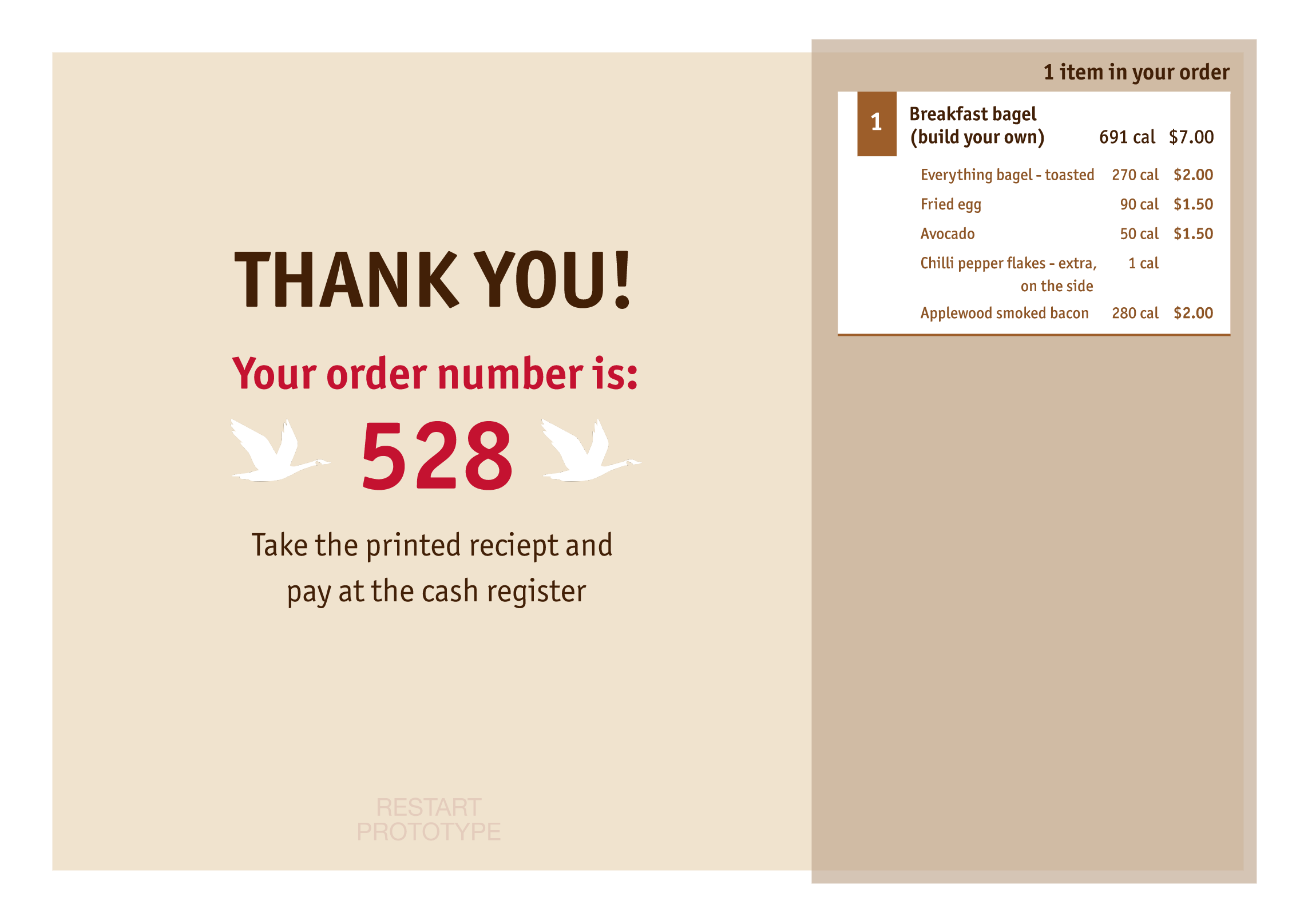
Stakeholder Prototype
(Hi-fi)
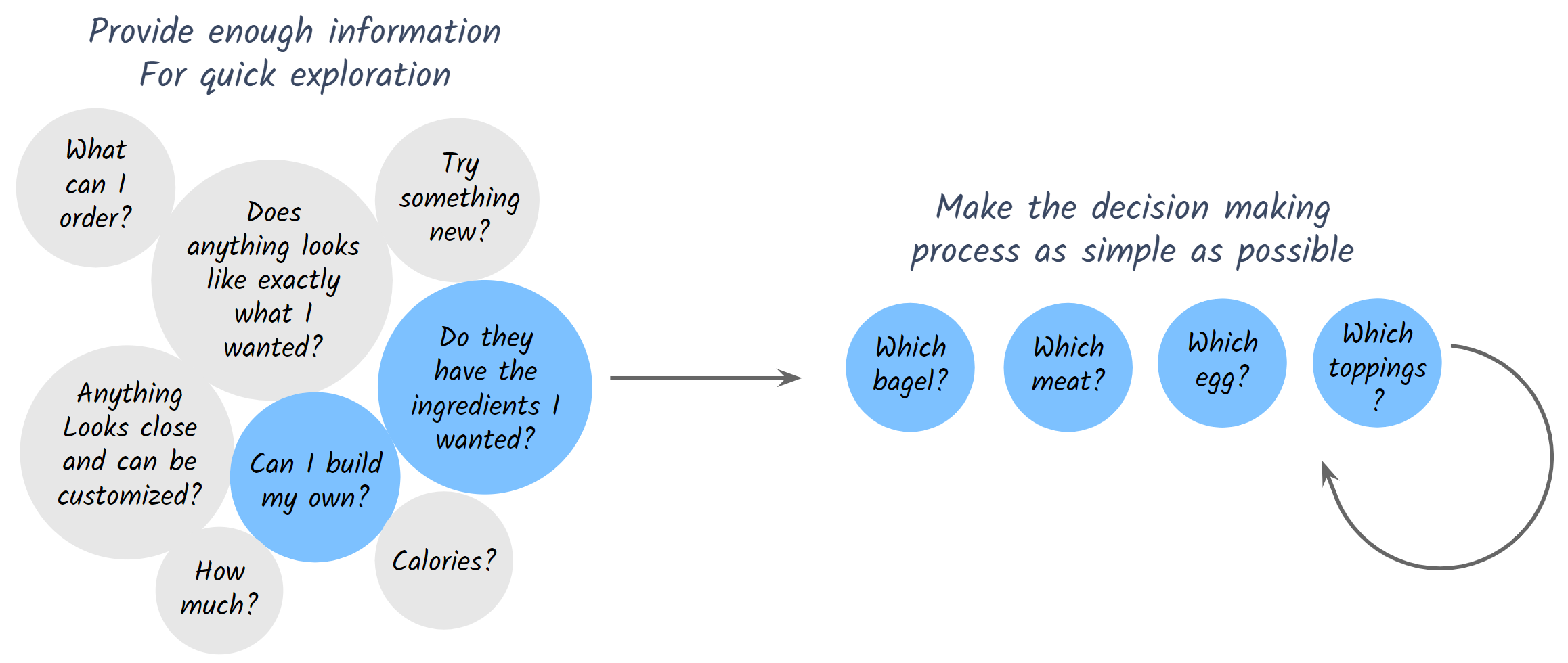
Revisit the user flow
Some findings from the first and the second rounds of usability testing are contradictory. Sometimes the users liked seeing many options all up, while sometimes they feel overwhelmed when all the options are visible and waiting from them to make decisions.
So I decided to take a step back and think about how people order things in real life when they go to a restaurant, not on a kiosk. The mind model I summarized for ordering food are shown below:
- At first, the customer may have many questions (shown on the left) and they may be bouncing back and forth between questions.
- Once they decide to answer one question, no matter how many choices they have to make to answer that one questions, they would generally make the choices one by one in a linear manner (shown on the right).
Therefore, I applied this on the kiosk digital experience:
- Give the customers all the high level information all the once for them to scan quickly.
- Once they focus on one problem to solve, take them through the choices linearly: one main call-to-action at a time with minimum distractions.
Sample screens


Recorded prototype demo
Retrospective
What went well…
- I learnt that quickly getting a prototype out to get the users reactions and iterate is very helpful for refining and validating design directions.
- Revisiting user flow and taking a step back to examine the big picture was helpful for discover the fundamental problem.
- Through the two rounds of usability testing, it was validated that designers are not necessarily the users. Designer’s personal preference and assumptions can be biased.
What could have gone better…
- Asking non-leading questions during the usability testing was challenging, but is important and requires practice and experience.
- To make the process more smooth, it would be good to arrange the usability testing before hands to book the users time.