3,856
Page views (April–July, 2023)
My roles
- Product design
- Interaction design
- Visual design
- UX research
Intended audience
Educators and students in advanced high school and undergraduate biology classes
Background
As the COVID-19 pandemic hit globally in 2020, there is an increased need in the biology classroom to learn more about:
- How an infectious disease spreads
- Strategies to reduce the spread
Mathematical models are often used by public health professionals to predict the spread of infectious disease and make decisions about the intervention strategy, but it’s challenging to teach such abstract concepts.
Empathize & Define
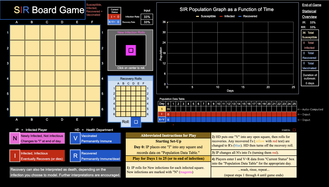
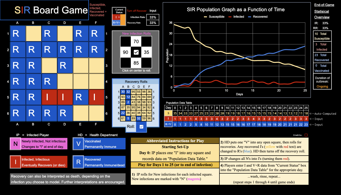
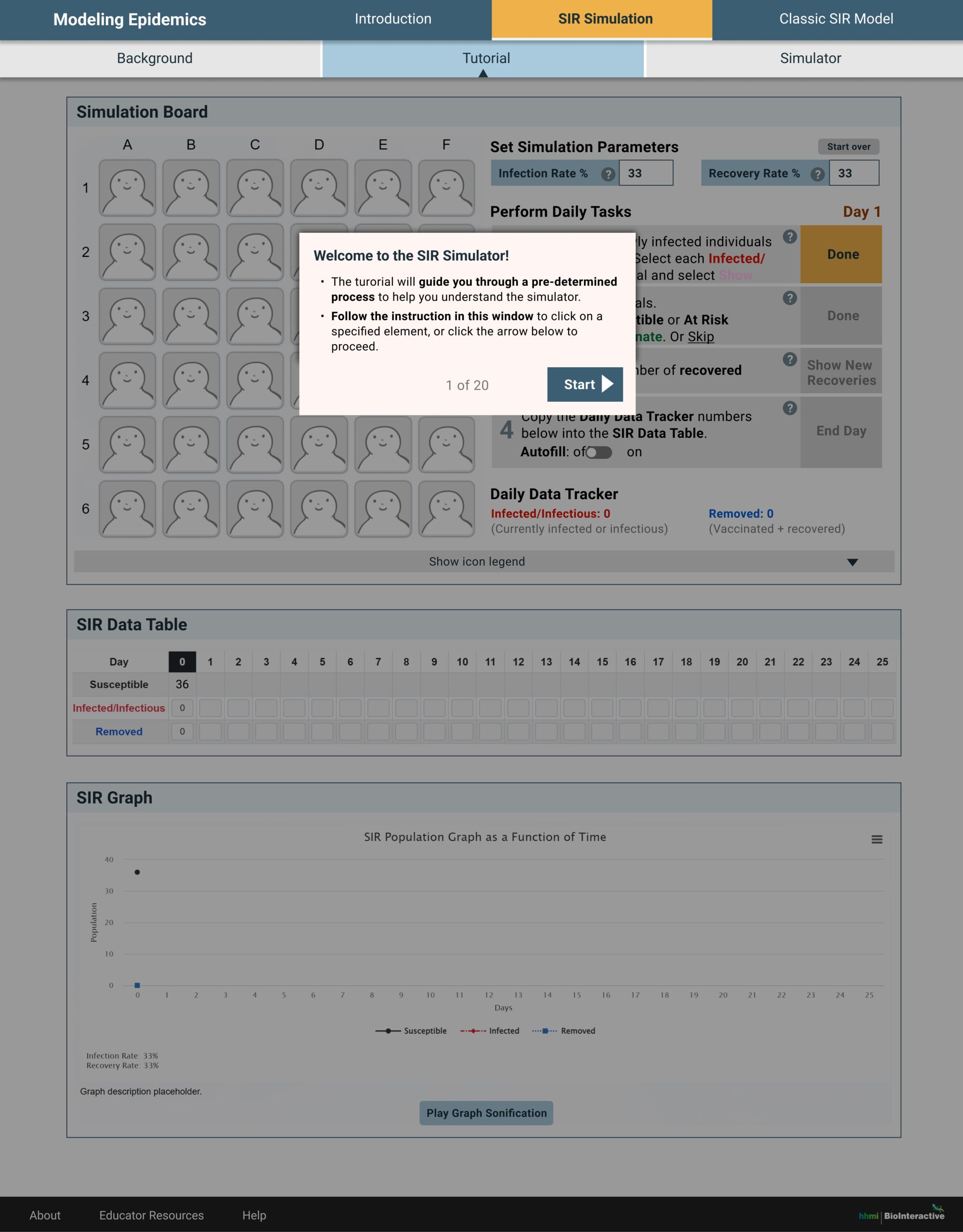
The initial concept of teaching the Susceptible-Infectious-Removed (SIR) model using a simulator, as shown below, was proposed by the content expert Nadeene Riddick, PhD, who shared an SIR model game concept in Google spreadsheet created by Daniel Newsome, PhD.


After performing stakeholder interviews, heuristic review, and secondary research, I’ve outlined our understanding of the problem and users as a high level guidance for the design.
Jobs-to-be-done
- Learn the mathematical models
- Apply the model to events in real life
Gains
- Simulation is more fun and engaging
- Customizable
- Daily events visualized
Pains
- Action flow unclear
- All information present at once
- Various changes happening simultaneously
- Steep learning curve
- May not be relatable
Ideate
Design
- Minimize the equations and calculations on screen, mainly convey the events with visuals
- Establish clear visual hierarchy by grouping relevant components
- Visually differentiate elements that are manipulatable and static elements
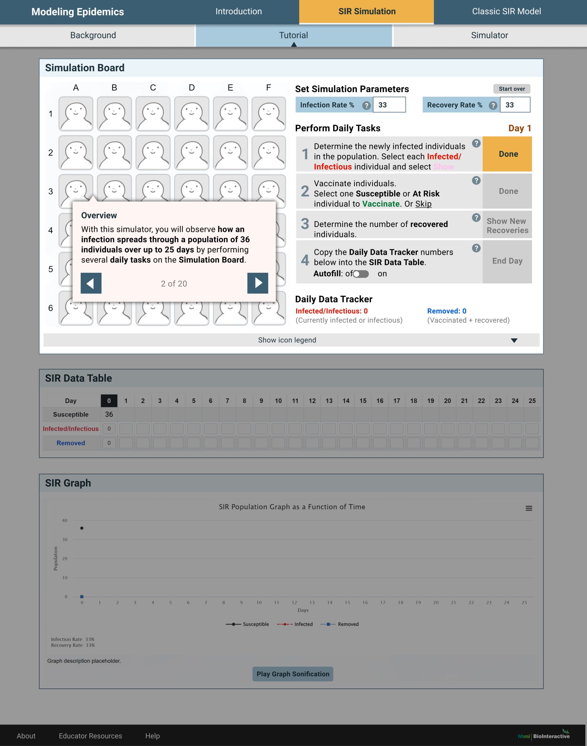
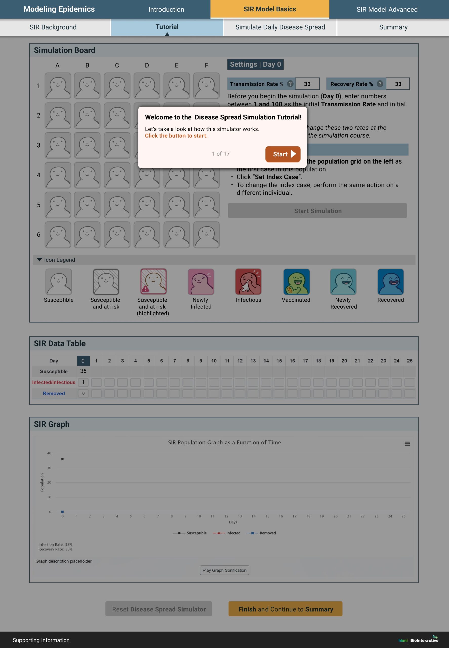
- Give the option to use the quick step-by-step hands-on tutorial
- Reveal or highlight one main action at a time in the simulator
- Use consistent typography and text format throughout
Content
- Chunk information into bit size bits
- Preload users with required knowledge
- Scaffold content and put advanced information into tooltips
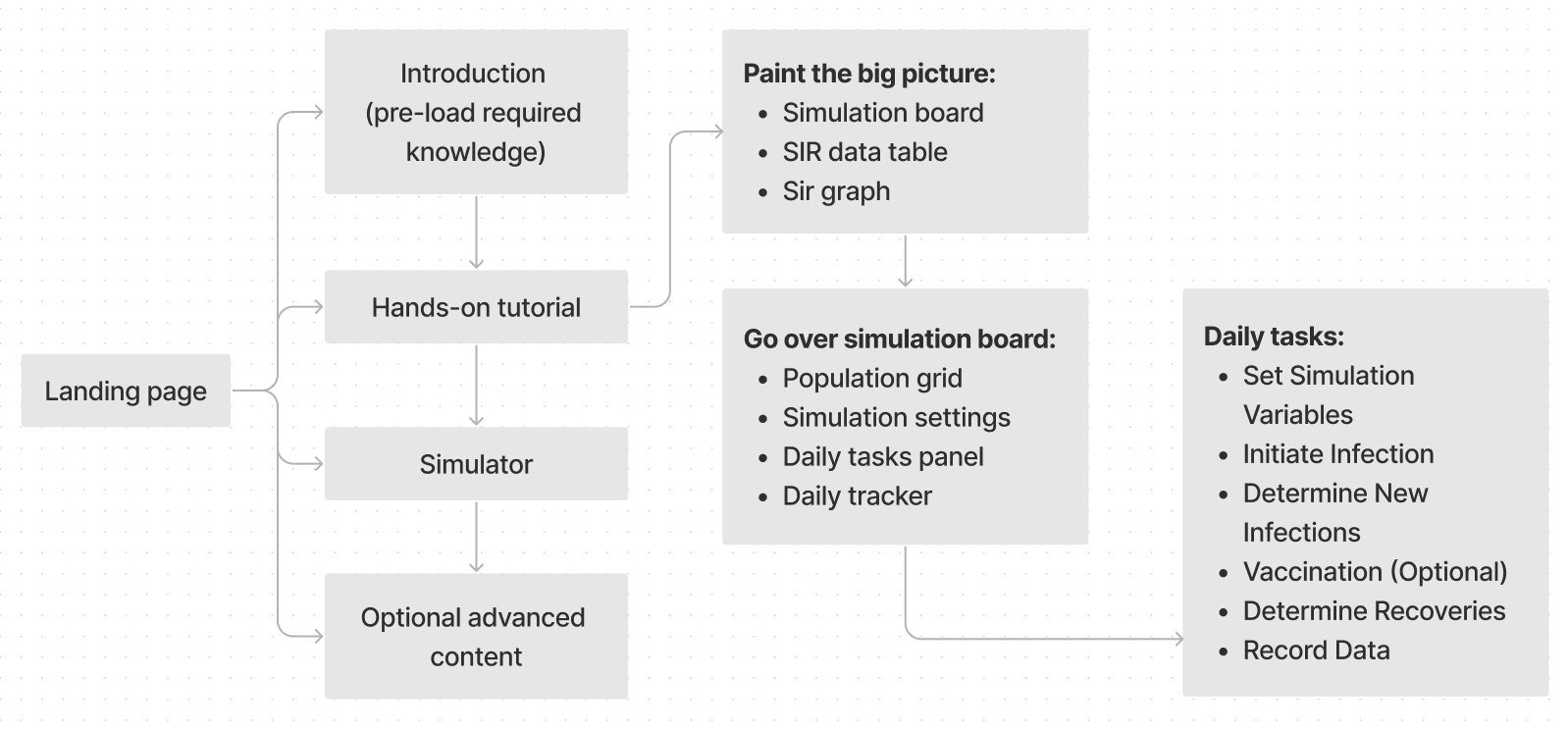
High level user flow


Test
Five educators were recruited and individually participated in a 1.5 hour moderated user interview.
Recruiting criteria
- Teaches high school general or advanced biology, or undergraduate (higher-ed) biology
- Has taught this topic or interested in teaching this topic
The interview notes were analyzed via affinity mapping and synthesized into research findings.
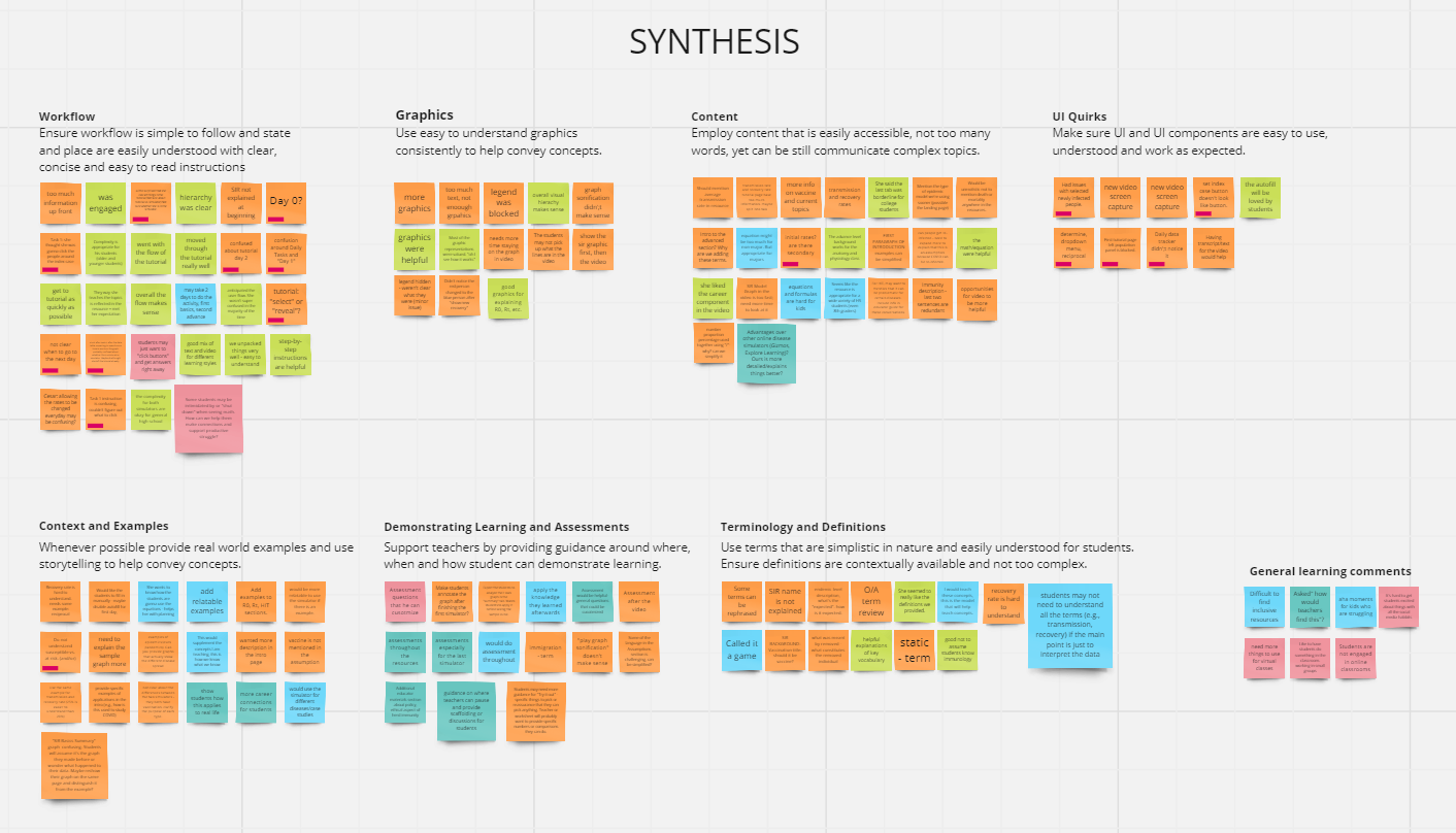
What’s working
- Engaging
- Graphics are helpful
- Overall hierarchy makes sense
- Tutorial is relatively easy to use and helpful
- Complexity is appropriate for the students
What’s NOT working well
- Some steps/states in the tutorial were not super clear
- Some confused the tutorial with the actual simulator
- More graphics, less text
- Need real world examples for abstract concepts
- Some terminology and definition were not explained well
- Need guidance around where, when and how to demonstrate learning and assessments
Improved prototype
A few more iterations were done based on the user testing findings, the stakeholder feedback, and WCAG audit findings.
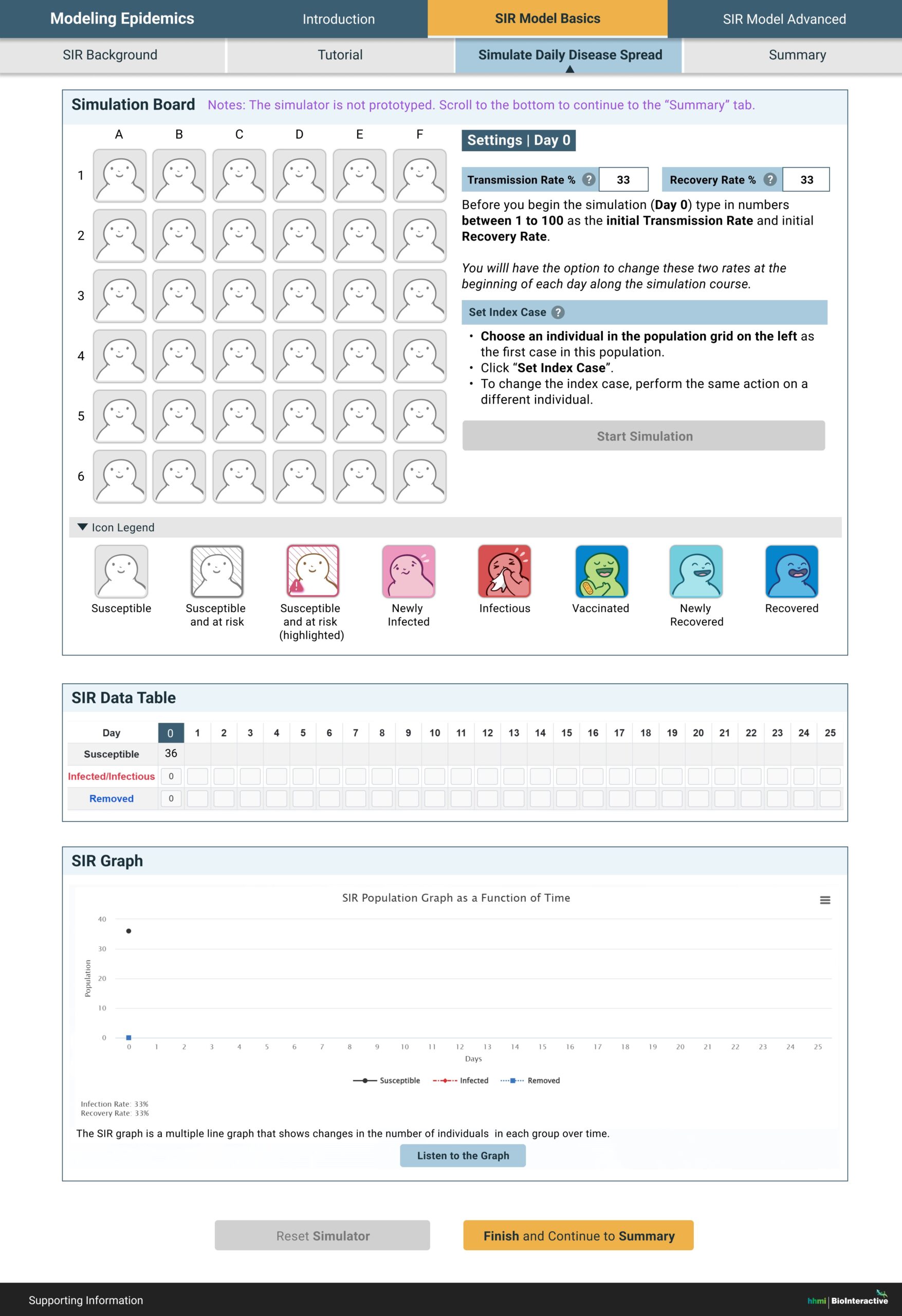
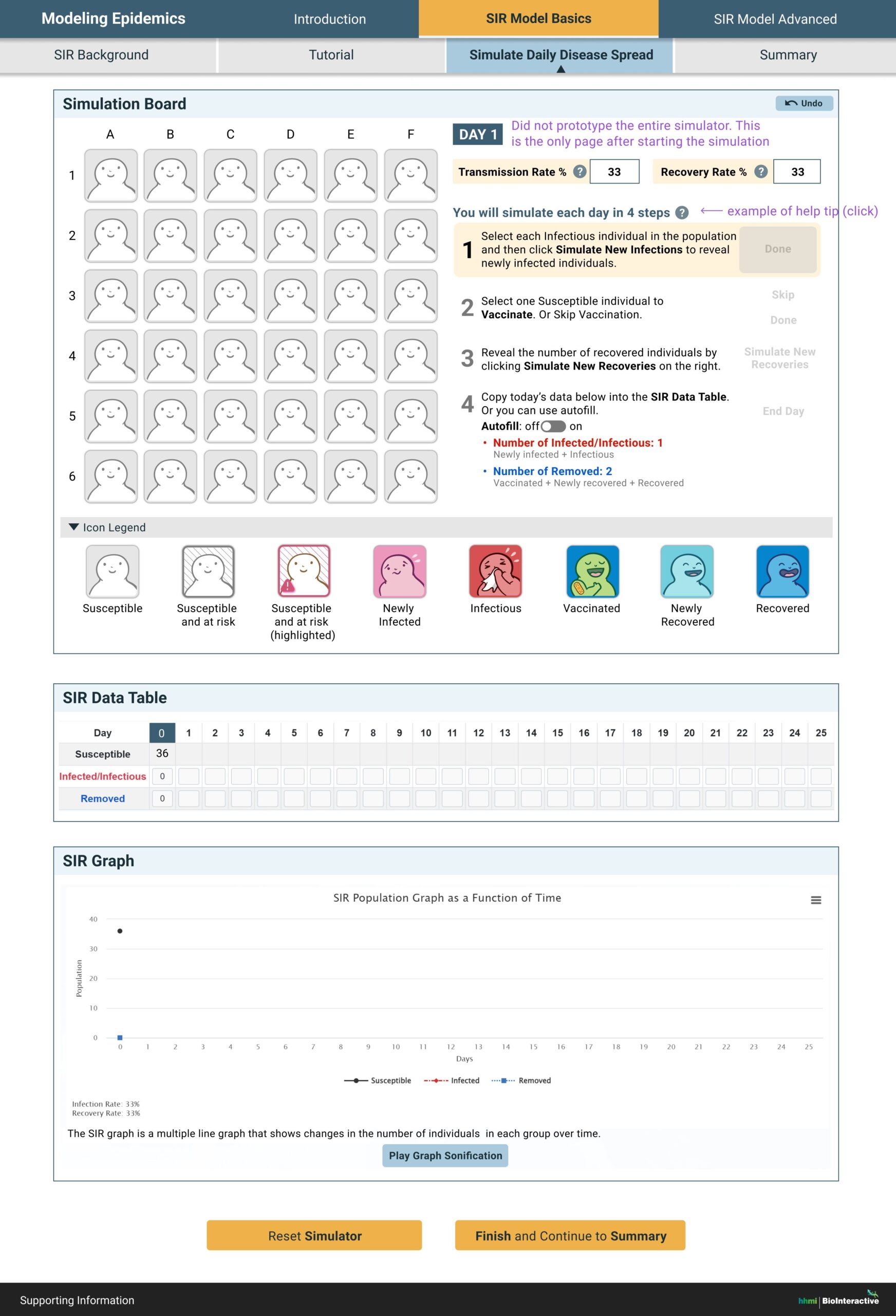
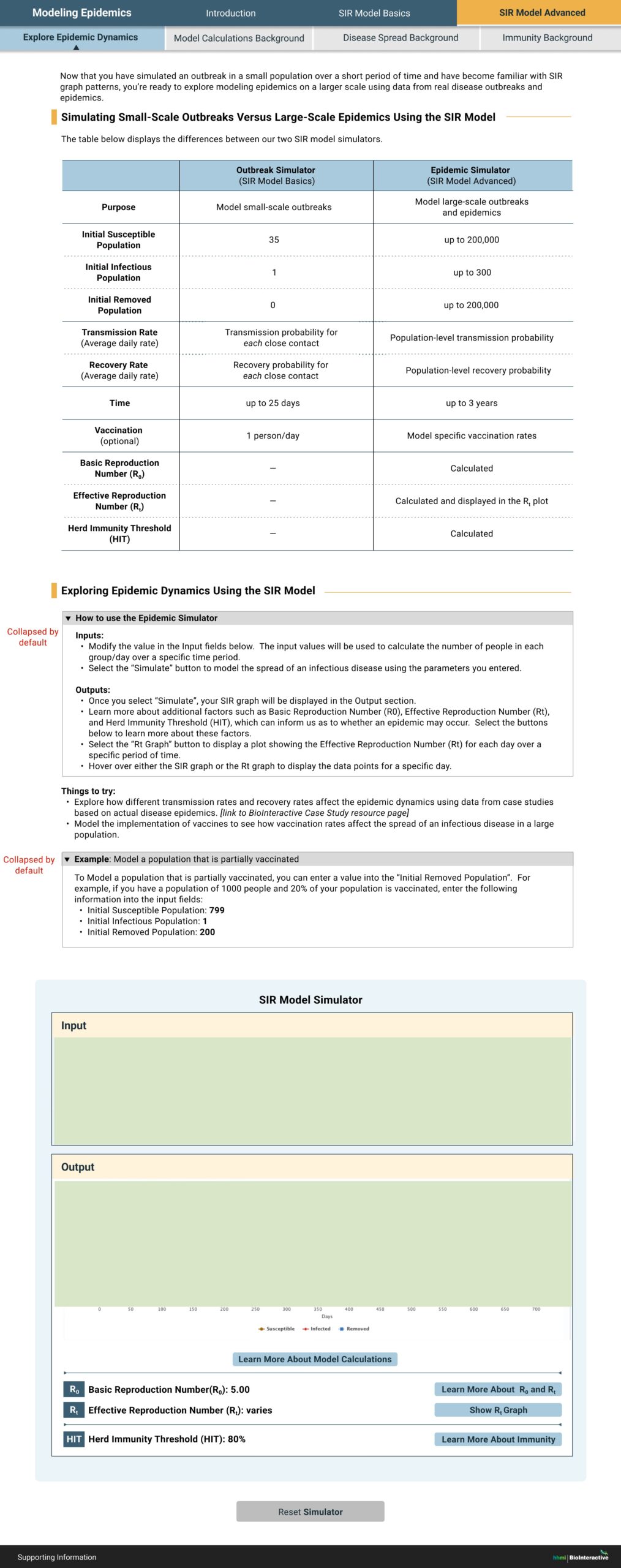
Sample screens


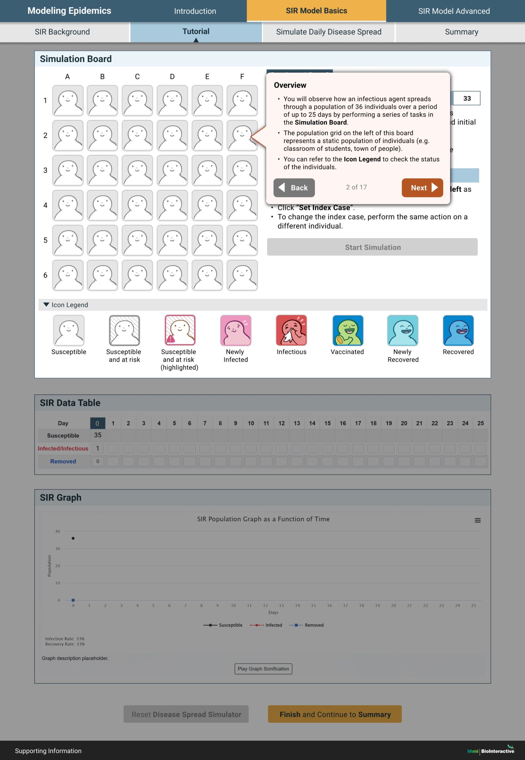
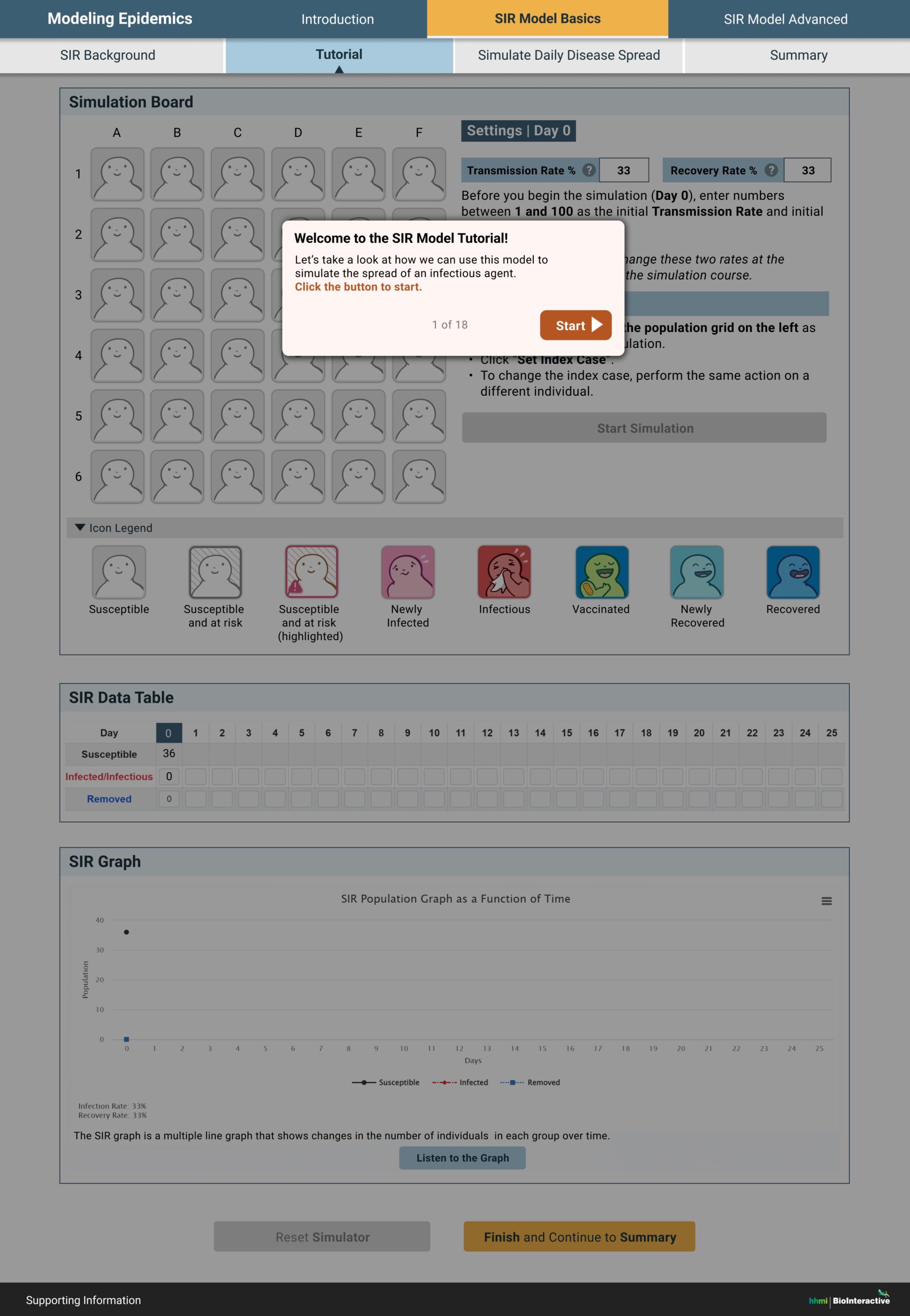
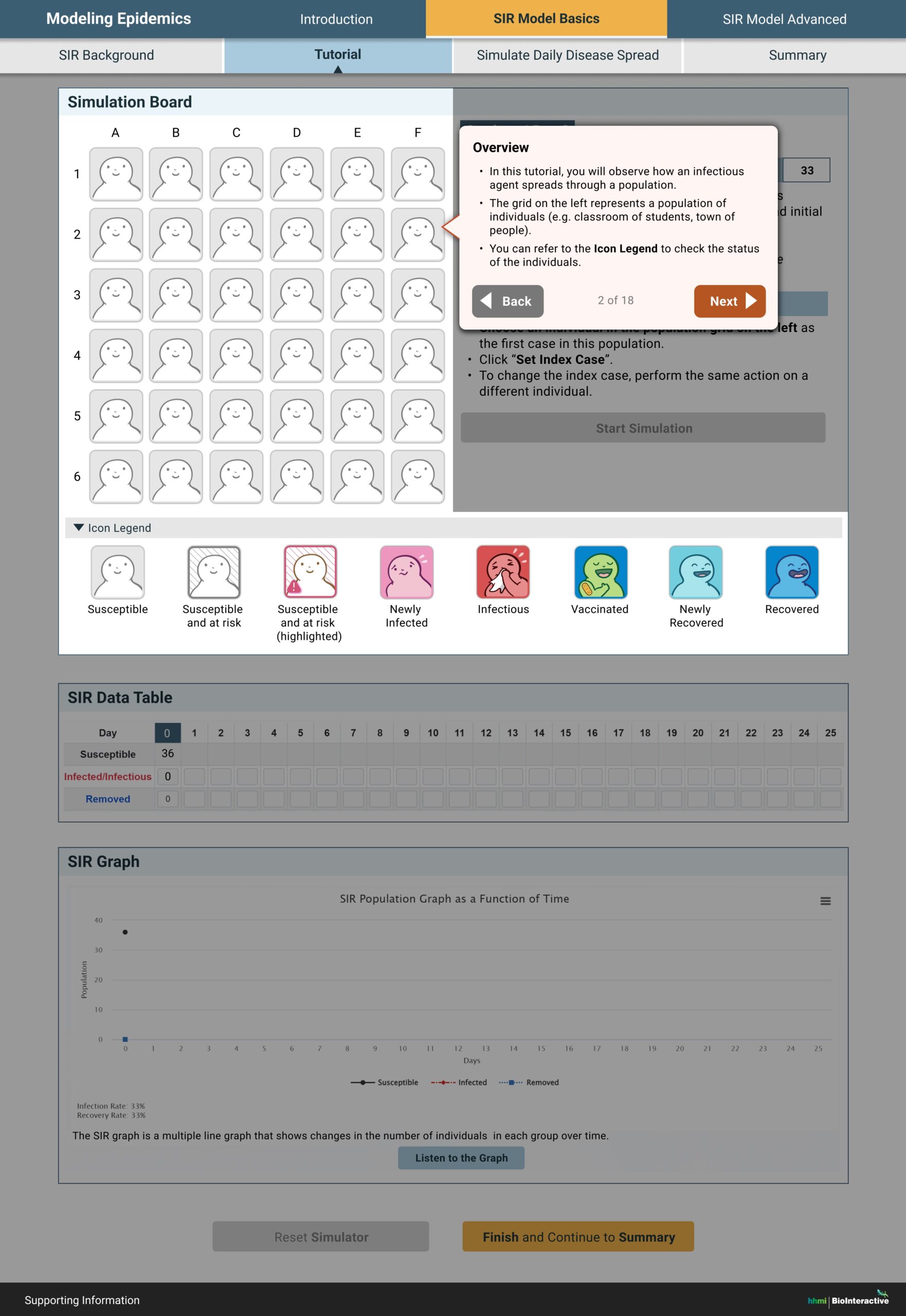
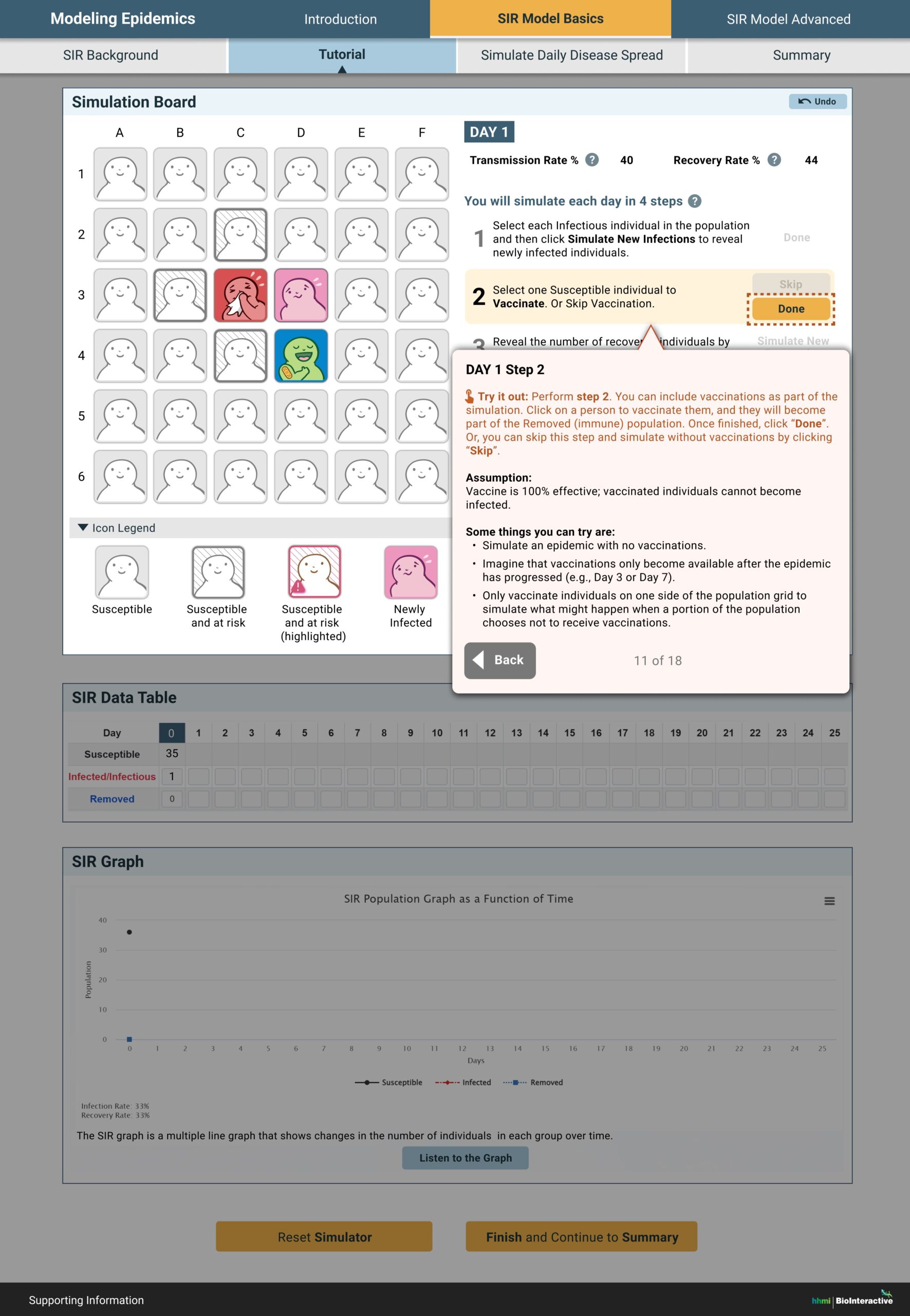
Exemplary changes
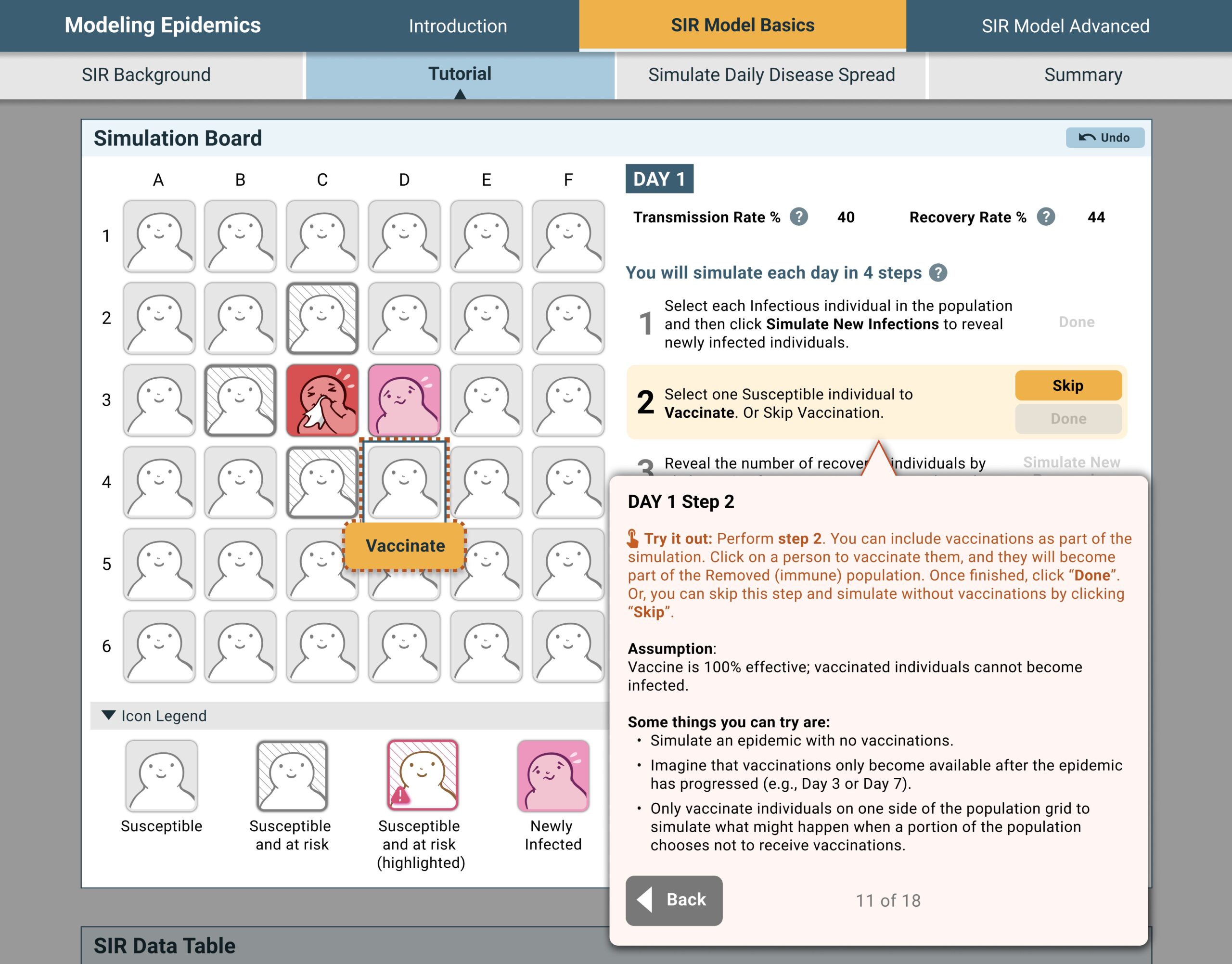
Highlight recommended action in the tutorial to help the users follow the flow.
Added icon and instruction to engage the users to try out the action, and to differentiate it from the actual simulator.
Removed editing box for parameters that are not editable anymore.
Unified all primary action buttons to the same style.
Provided examples as real world context, and also for novice users who may need additional support.
Scaffolded the advanced content into the last optional tab.
Called out the definition of key parameters.
Added real world examples.
Added detailed comparison between the basic simulator and the advanced simulator in the optional tab.
Scaffolded some helpful context into collapsible sections so there is less text on the screen by default.
Retrospective
What went well…
- Overall the product was well received by the educators and timely filled a niche for teaching infectious disease spread.
- Conversations with educators who are actively teaching this topic was super helpful
- Information overload is real…even for experts who are familiar with this field. Scaffolding and chunking the information helps the learners tremendously.
- The project lead, the developer, and other stakeholders worked well together as a cross-functional team.
What could have gone better…
- I wish I had aligned on the design and production process better with stakeholders in the project kick-off meeting, which will reduce the time spent on getting buy-ins later in the project.
- Establishing a component library would have made the iteration easier and faster.
- If the resource allows, it would be nice (and fun) to allow the students to examine the data behind the scenes/simulators.
Special thanks
I’d like to sincerely thank Pilar Strutin-Belinoff for her guidance and support on UX research and design in this project!