289,019
Page views (June, 2019–July, 2023)
”“...and I met yesterday to work on the student guide for how to use the Population Dynamics C&L in the context of R zero and pandemics. We were delighted to see that there is a new appearance to the Click & Learn and even more functionality. It's fantastic!”
—A high school educator
My roles
- Product owner
- Product design
- Interaction design
- Visual design
- UX research
Intended audience
Educators and students in advanced high school and undergraduate biology classes
Background
An existing Population Dynamics app needed to be rebuilt due to expiring third party plug-ins. Meanwhile, we’ve heard from educators that the app was a bit difficult to use and has a steep learning curve, therefore, we decided to re-design the whole app from scratch. We had about 3 months to re-design and re-build the app due to the expiring date.
Empathize & Define
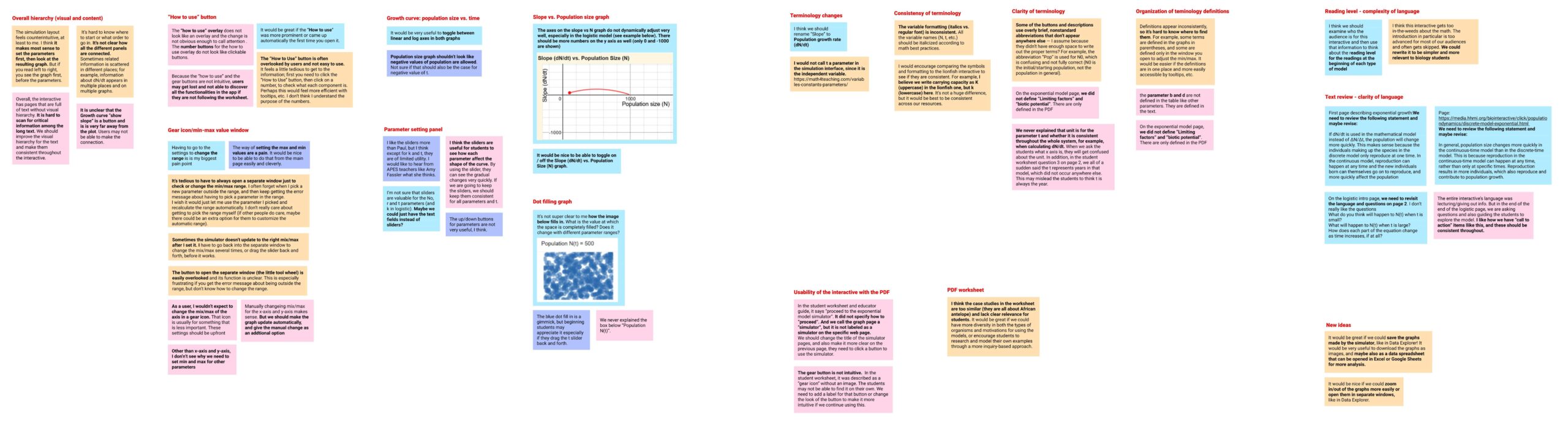
To quickly get insights on what’s not working, I invited three content experts to conduct heuristic review on the old app. The findings were synthesized through affinity mapping.
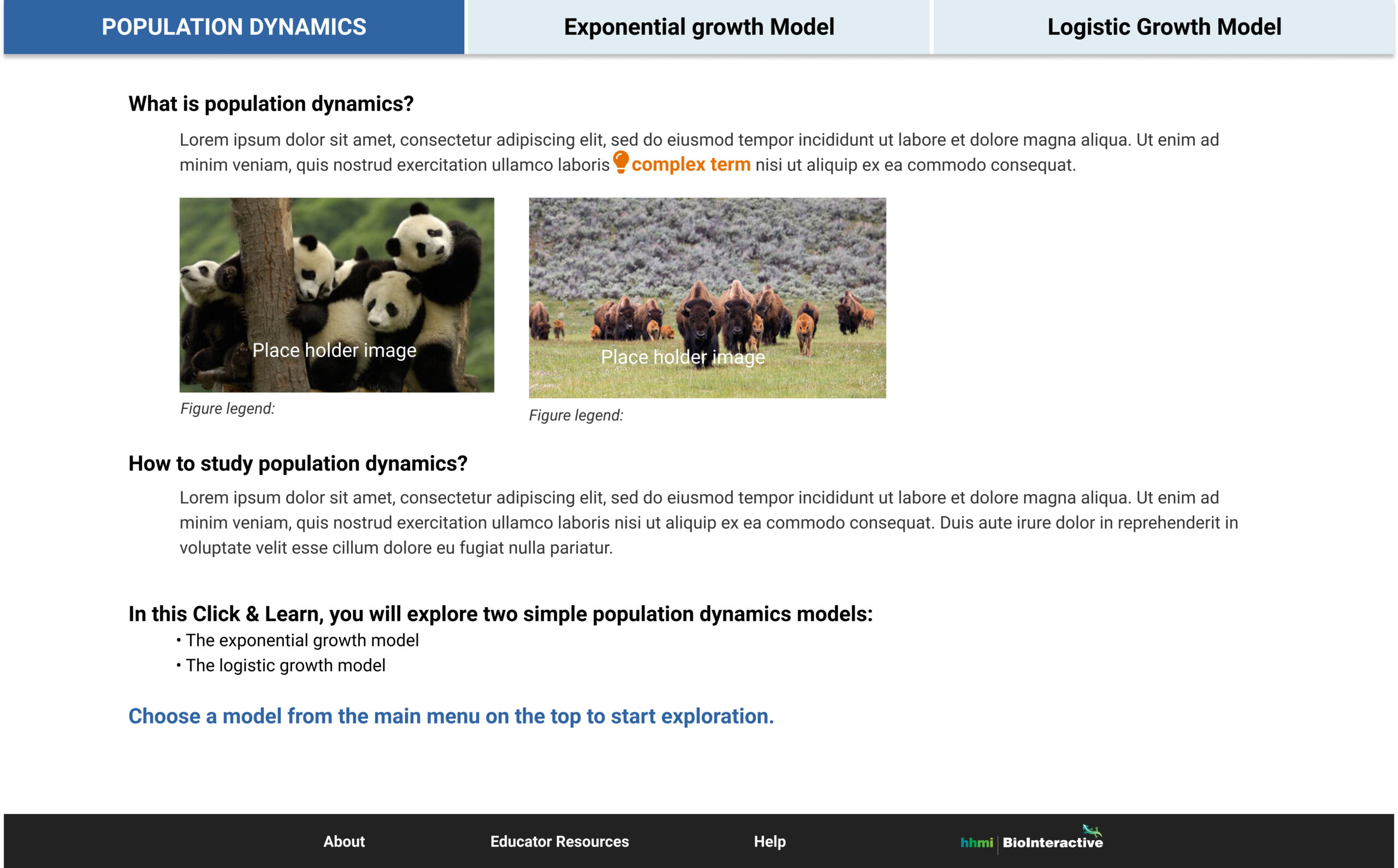
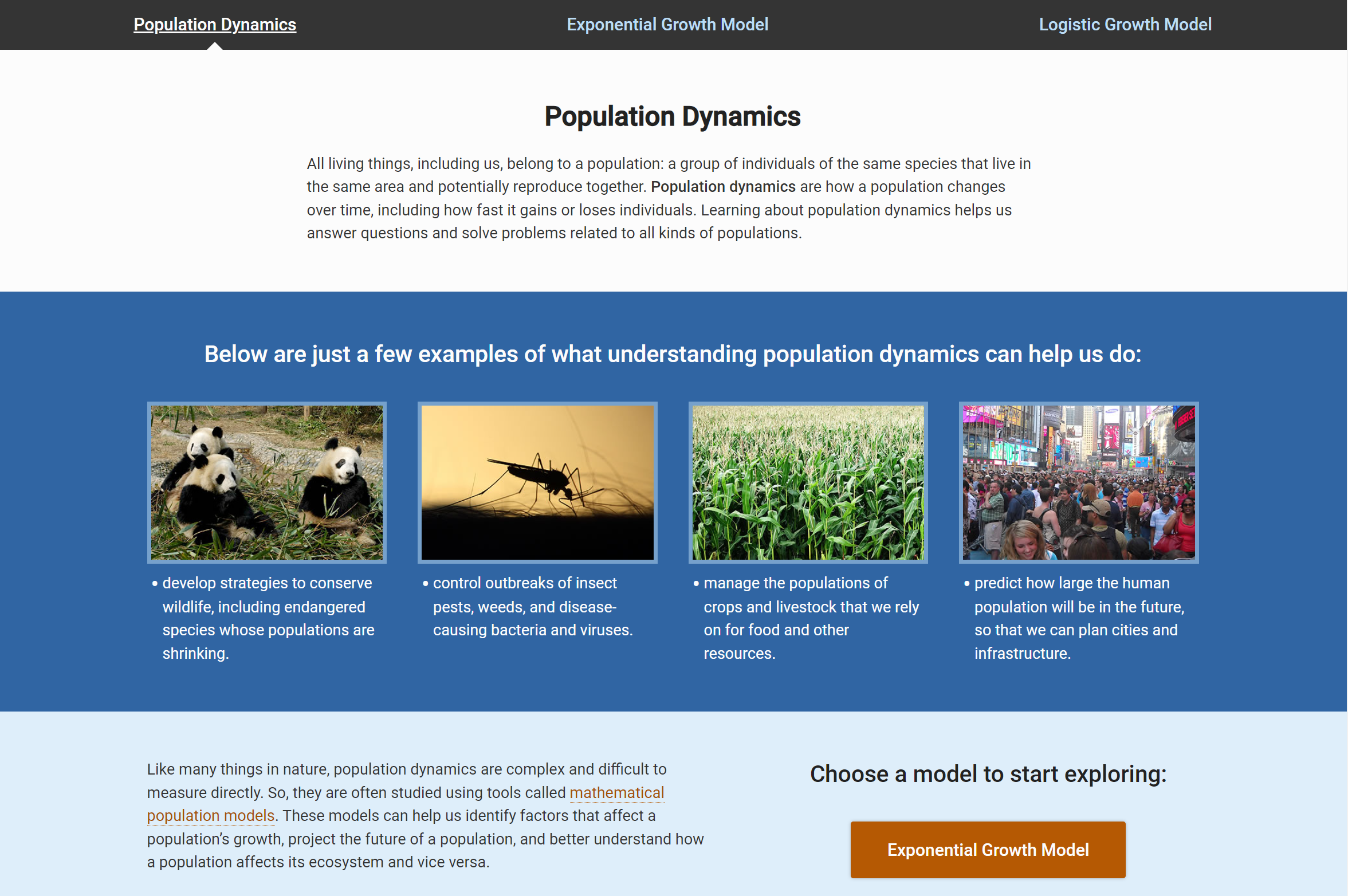
Sample screen of the old app
Heuristic review (affinity map)
Ideate
Design
- Make sure the action items are clear at each stage
- Minimize the equations and calculations on screen
- Establish clear visual hierarchy by grouping relevant components
Content
- Chunk information into bit size bits
- Preload users with required knowledge
- Scaffold content and put advanced information into tooltips
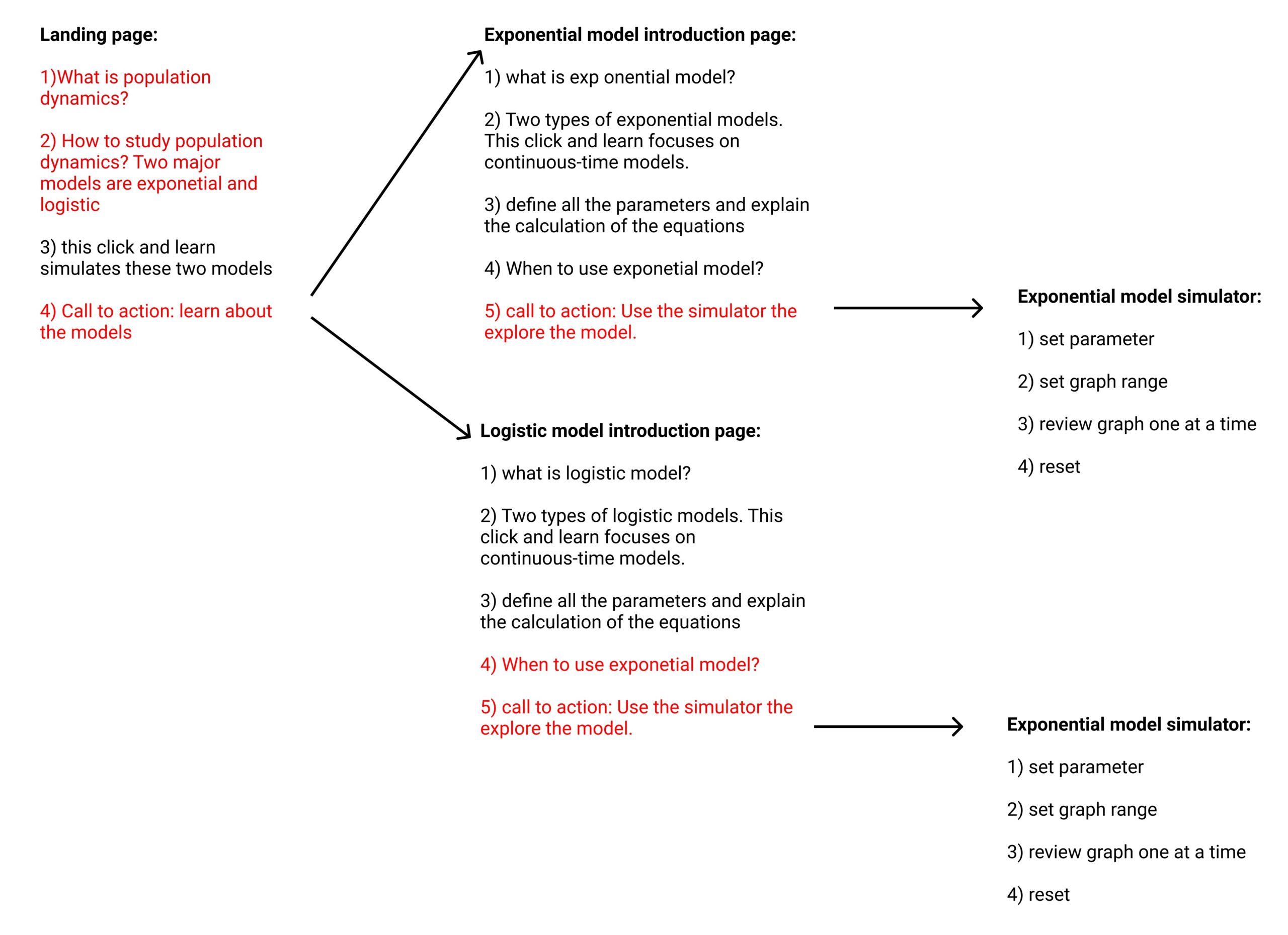
High level user flow


Final build
The three content experts were engaged again to review and test the working prototype. Meanwhile, I started to work closely with the third party vendor to build the app due to the tight timeframe. We continuously adjusted the design during the development and reached a version ready for publication before the old app expired.
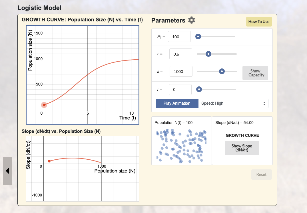
Sample screens


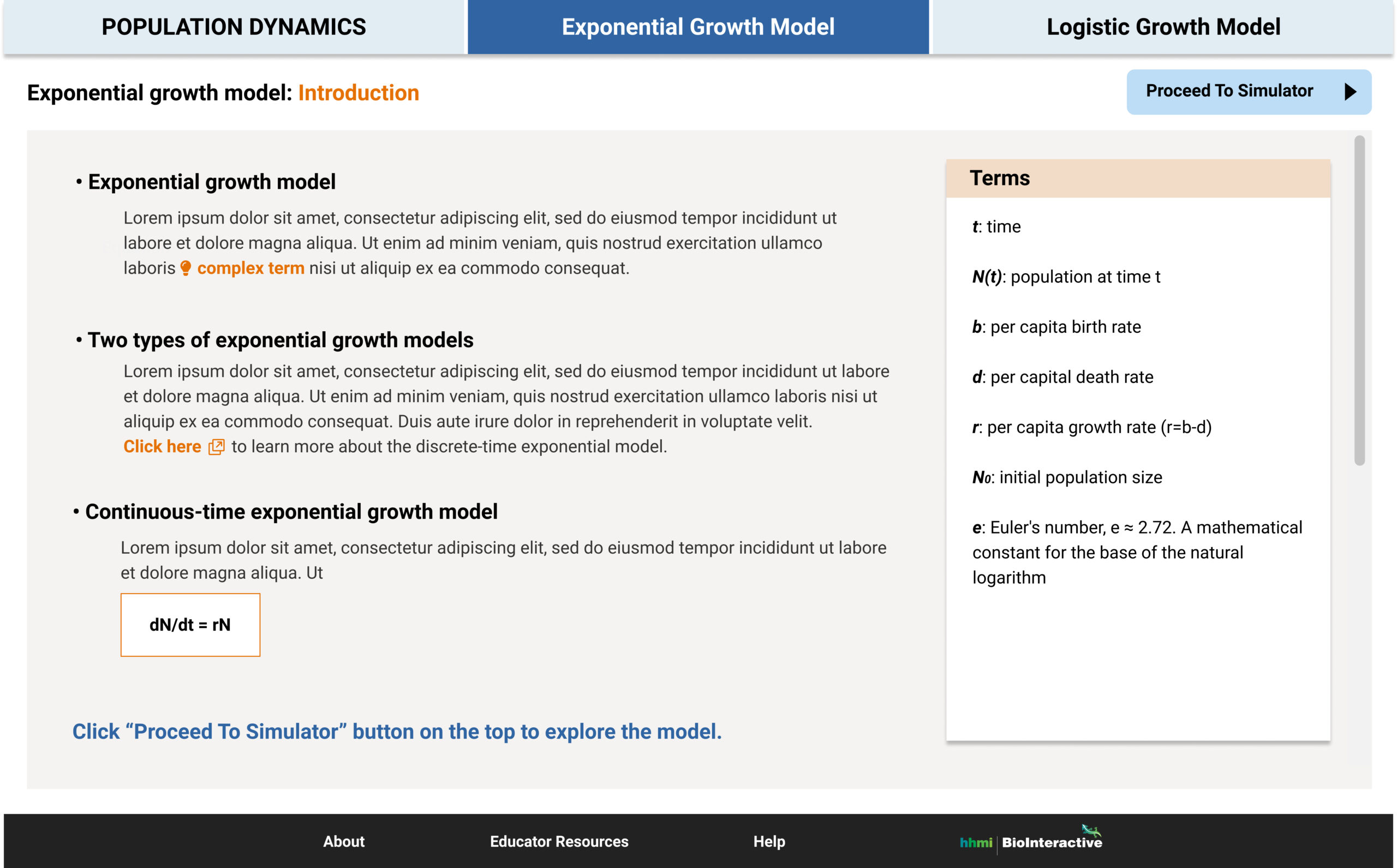
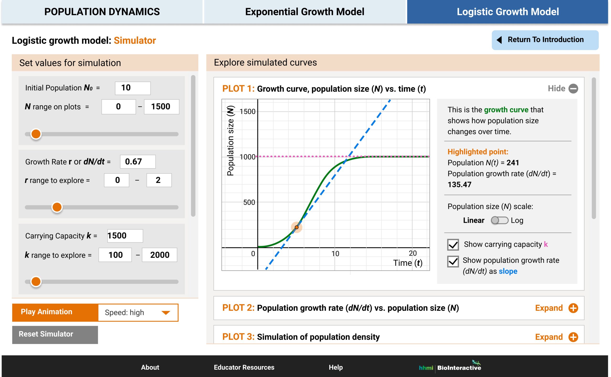
Exemplary changes
Scaffolded advanced info into tooltips.
Added an example in case the users want to see a real world example.
Summarized all the parameters in one place as a sticky panel.
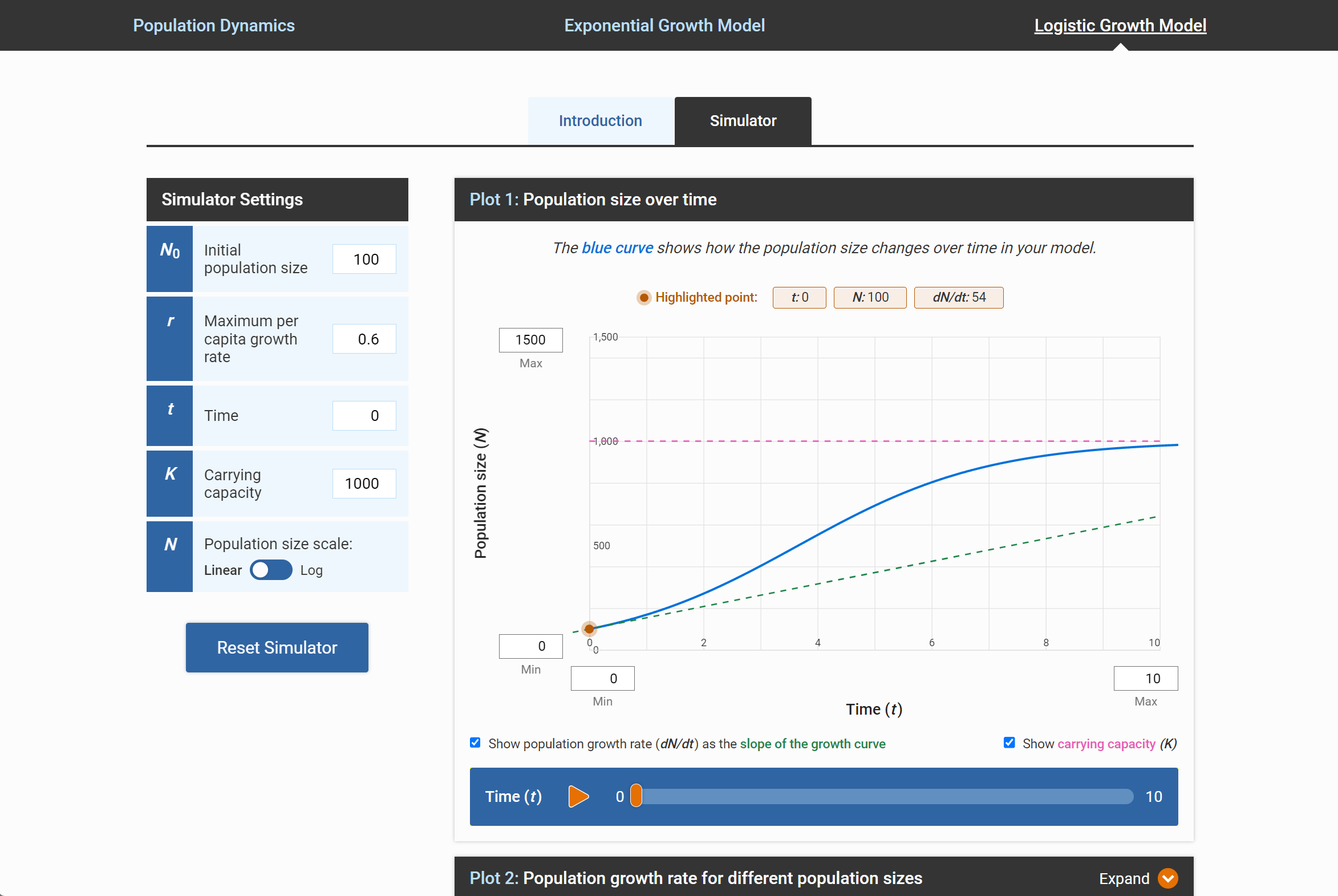
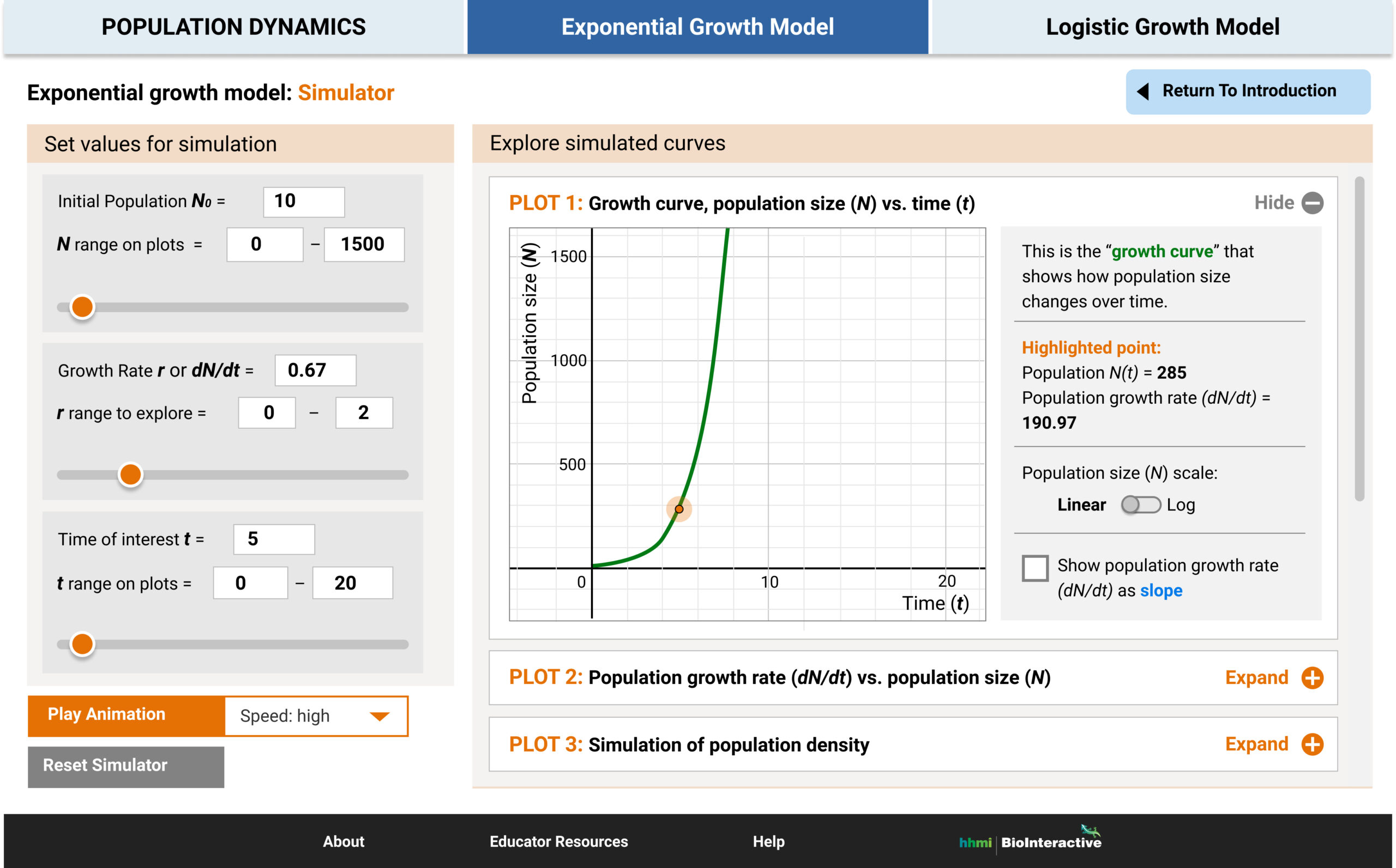
Pulled the main parameter settings to the left. Encourage the users to manipulate them first.
Highlighted the property of the active point in the graph.
Introduced the play button and play bar to resemble a generic video player and encourage the users to use it to see the changes.
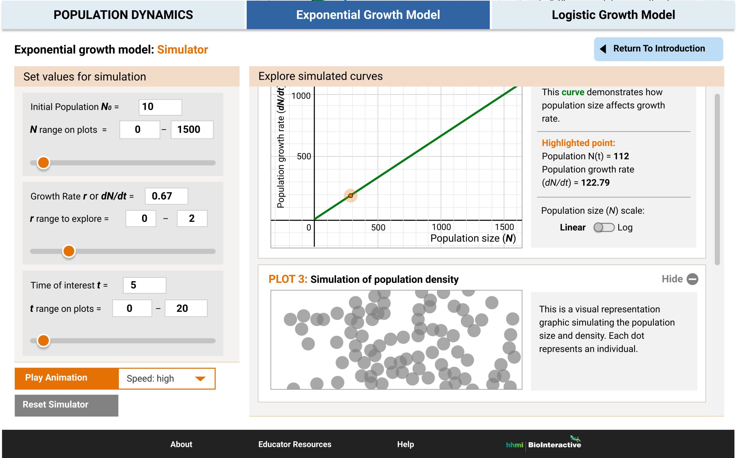
One of the concerns of the old app was the graph auto-adjust its size. Here we introduced the ability for the users to manually adjust the graph scale/size.
Collapsed the second affiliated graph to help the users focus on the main graph first. This is also to reduce information overload.
Retrospective
What went well…
- The app was successfully redesigned and built in 2.5 months!
- When resource was limited, some quick UX research design methods were used effectively.
- More users found it easier to teach this abstract concept using this app.
What could have gone better…
- This topic can be very dry, I would like to spend more time to make the content more engaging, for example, through usage of graphics.
- During the development, we had to design some work-arounds to achieve some complex functions due to the tight timeline. If I had more time, I’d like explore other potential approaches/designs.